 I’m continuing with my increasingly popular “Do’s vs. Don’ts” feature which I began last spring. I promised whenever something arrives in my mailbox that seems a good ‘teaching opportunity,’ I would share it with you. I hope you find this example useful for all your online fundraising campaigns!
Today’s teaching example is a donation landing page (where you land when you click “donate” from the Main Menu) and donation form (the part a donor fills out once they click through from your landing page).
Too often, fundraising staff leave these aspects of their campaign completely up to IT, website or marketing staff. It’s a shame, because these campaign elements can make or break you. Everything you’ve carefully crafted will be for naught if the landing page and form are in any way off-putting or daunting to complete.
I came across this example in an effort to make a memorial donation honoring someone who had worked at this nonprofit. We’re going to evaluate every element methodically.
I’ll ask you some questions.
- Would you click through from that landing page to learn more or to donate?
- If yes, why?
- If no, why?
- What looks good about it?
- What looks not so good?
- Would it inspire you to give?
- If so, why?
- If not, why not?
First, I’d like you to think about your answers and jot them down.
Really take the time to notice what you like and don’t like.
I promise you’ll learn a lot more this way.
Second, I’ll tell you what I think.
Let’s begin!
DONATION LANDING PAGE

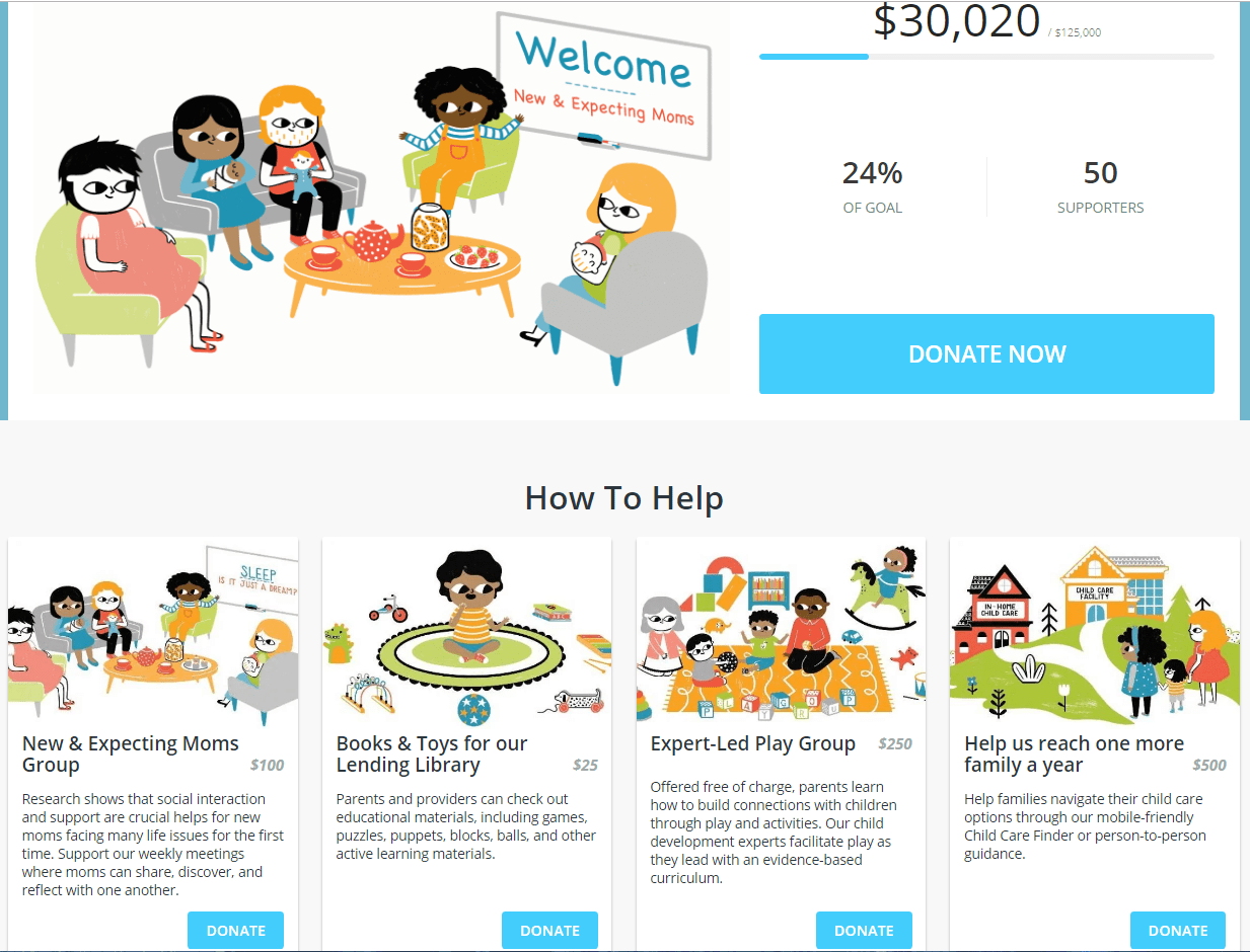
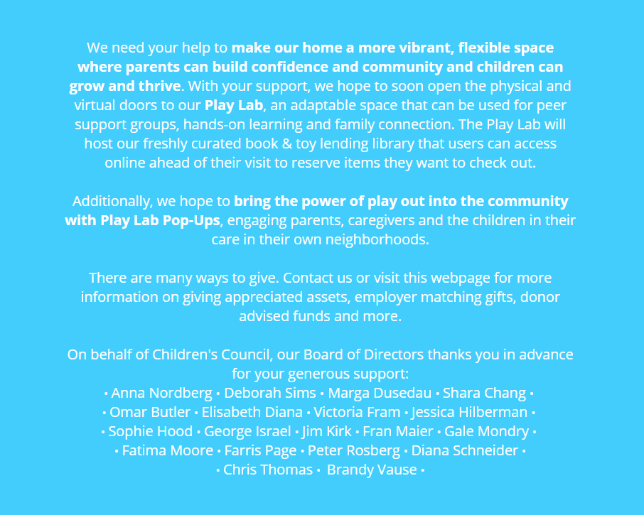
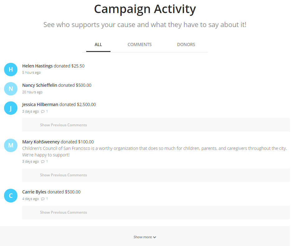
What’s your verdict? Do you think this landing page is a “Do” or a “Don’t?”
Think it through yourself first.
Don’t cheat and go straight to my thoughts.
First, I’m not always right. You may find something to like/dislike that I missed!
Okay… have you jotted down all your thoughts?
All right.
I’ll share my thoughts with you now!
There’s a lot here to like. And a few areas for improvement.
Like:
- Different specific project options for giving.
- Specific attached price tags.
- Inclusion of appealing graphics (works for them because child-like.) Photos probably would be even more compelling.
- Menu at top is stripped out — so all user can do is click on “donate.” When asking folks to make a financial gift, you only want one call to action. If they can also click on “more info;” “volunteer;” “programs,” or even “main menu,” they’re likely to become distracted. Once you get folks on your donation landing page, don’t let them leave!
- Testimonials from donors – e.g., “Children’s Council of San Francisco is a worthy organization... .” Testimonials offer ‘social proof’ your organization is doing an effective job. It’s a bit like offering a Yelp review at point of purchase, reassuring folks they’re making a good decision – so, “don’t hesitate… go for it!” becomes the message.
- Including board member names – also serve as ‘social proof’ community leaders support this organization. If I see a name I know, I’m more likely to follow through with a donation.
Don’t like:
- “Log-in” feature top right (very confusing). Why do I need to log in? Clicking on this feature leads me someplace that’s even more off-putting
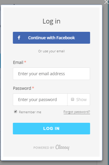 What if I don’t have a Facebook account? You shouldn’t make donors do any extra work — like creating an account with user name and password — in order to make a donation. Clearly this is something that’s a default on the software program they’re using to facilitate donations. It’s important to take care not to let these default settings take over. Contact the support team to find a way around this. Chances are if you see a problem, their other clients have already reported the same problem.
- Reverse-out text is hard to read.
- Dense text is hard to read.
- Organization-centric text is off-putting – too much “we,” “our” and “us.” Always try to use “you” and “your” so donor feels they are the one making the impact.
- “On behalf of” text is distancing. Strive to be direct and personal. This would be an improvement: “Thank you in advance for your generous support! Board of Directors: Name, name, name…..”
- Showing names/amounts of donors (there’s a place when folks give where they can choose to remain anonymous. Still… don’t think it’s clear that both your name and the amount you gave will be public.) On the other hand… I do like the fact there’s a space for comments, so donor testimonials can be public.
CLICK-THROUGH TO DONATION FORM
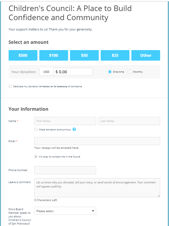
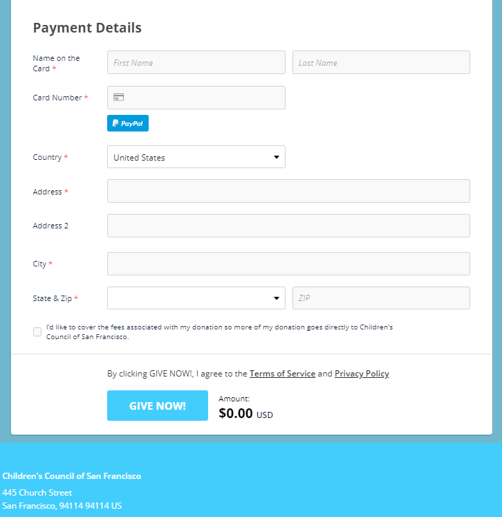
By now, you know the drill. Take a look at this form and decide what you like and don’t like about it.
- Would you complete this form?
- If yes, why?
- If no, why?
- What looks good about it?
- What looks not so good?
- Would it inspire you to give?
- If so, why?
- If not, why not?
Is this form a “Do” or a “Don’t?”
My overall verdict here is “Do.” There’s not much to dislike. Specifically, I like:
- It’s straightforward, not too lengthy, and doesn’t include a lot of extraneous fields.
- It offers suggested giving amounts. The donor doesn’t have to guess what amounts might be appreciated. And “other” is always an option for donors who want to give more or less.
- It offers a monthly giving option.
- It offers a check-off box if donors are willing to be contacted by the charity in the future. Since I’m a memorial donor, and not necessarily giving here because it’s one of my chosen philanthropies, this is much appreciated. You might think it makes sense to try to turn memorial donors into ongoing donors — why not? I’ll tell you why not: if these folks don’t want to learn more about you they aren’t good prospects. You’ll simply waste time and money — and wonder why the percentage return on your email appeals is so low.
- It offers a space to leave a comment. Again, this is a terrific way to collect testimonials you can use in the future. Just be sure you have a way to save this information so you can access it when you need it.
- It asks: “Did a Board Member speak to you? I’ve actually never seen this before, but it strikes me as a good way to track board member activity in serving as an ambassador, advocate and asker on your organization’s behalf. Be sure to follow through with the board member to let them know how much you appreciate them sharing the love!
- Payment details are straightforward and offer multiple options, including PayPal.
- The organization’s mailing address is at the bottom, perfect for those who prefer to write a check rather than give online. It would be great if there was also a phone number, with the name of a specific contact person.
- It offers an option to cover transaction fees. Did you know, if available, donors choose to cover transaction fees 55 to 60% of the time? And when donor covered fees is on by default, 75 to 85% of donors cover transaction fees? This is a hidden source of donor gold.
Lessons Learned
1. Donation landing pages can make or break your campaign. They’re what inspire people to click through and complete their donation.
2. Donation landing pages need to be inspiring. Try to include some visual components that remind folks how their money will help. Problems described should be specific, not broad. The goal is to quickly convey to donors how to be the hero who gives the story you’ve described a happy ending. A big donate button, or series of donate buttons, can help assure people click on the link and go to your donation form.
3. The best donation forms are simple to complete. They don’t include a lot of extraneous fields that may stop the donor dead in their tracks. You don’t want to make donors think too hard. Remember, first and foremost, you want the donor to follow through with their gift!
4. Donor centricity is a must. Consider every element of your form, asking the question: “What might a potential donor think about this?” If you think they wouldn’t like it for some reason (e.g., they’re asked to give personal demographic information, or too much contact information), nix it from your form. You can always ask for additional info in your thank you email or mailing. First things first.
5. Don’t leave implementation of donation landing pages and forms up to non-fundraising staff. It’s your job to offer advice and counsel, coming from a donor-centered perspective.
What do you think? Am I off base? Please share in the comments below.
Want to raise a lot more philanthropy next year?

You can’t afford not to ask for major gifts!
You’re invited to join my most popular course, Winning Major Gift Fundraising Strategies. It’s got everything you need to begin and/or ramp up a tried-and-true major gifts fundraising program. Everything we’ve discussed above matters, of course. But don’t lose sight of the forest for the trees. A whopping two-thirds of all household charity in the U.S. comes from the top 3% of U.S. households. It simply makes sense to follow the money — and you’ve likely got some of these folks hiding in your database. Charities of all shapes and sizes can, and should, make the most of their fundraising efforts by building a powerful major gifts initiative.
The “Early Bird Discount” runs through December 28th, so grab it now! Questions about whether this course is right for you? Simply contact me at claire@clairification.com.
Please note: Sometimes I can’t omit the name of the charity in the examples I use. Please know I’m coming from a place of love, and don’t mean to shame anyone. As with almost anything you can think of, there’s good AND bad in the examples I share. We learn both from mistakes and stellar efforts. Our own, and others. Kudos to all who put things out there and make an effort. The only way you learn is by trying. If I ever use you as an example, and you disagree or want to clarify, feel free to contact me directly.


