 Here comes my occasional “Do’s vs. Don’ts” feature, where I share with you something arriving in my mailbox that seems a good ‘teaching opportunity.’
Today we’re going to review a major donor engagement strategy.
It arrived as an email. There’s a subject line, preview pane, the email itself, and what happens if/when you click through.
We’ll take a look at the various elements; then assess what works/doesn’t work.
I’ll ask you some questions.
- Would you open this email?
- If yes, why?
- If no, why?
- What looks good about the email?
- What looks not so good about the email?
- Would it inspire you to click through?
- If yes, why?
- If no, why?
First, I’d like you to think about your answers and jot them down.
Second, I’ll tell you what I think.
Really take the time to notice what you like and don’t like.
I promise you’ll learn a lot more this way. We learn best by doing.
Seriously, I mean it.
Let’s begin at the beginning.
Subject Headline
Claire, tell us what you think
Preview Pane
We’d like to hear from you
This may help: Take three minutes and jot down your answers to the first three questions on a piece of paper or your screen. I want to know if what was in the subject headline (“Claire, tell us what you think”) or the email preview pane (We’d like to hear from you”) would have caused you to open the email or hit ‘delete.’
Okay. Ready to learn what I think thus far, and also see what else we’re working with?
Let’s begin!
Does this Email Say “Open Me?”
What’s wrong or right with this subject line?
Claire, tell us what you think.
Your email subject line and preview pane are the online equivalent of the direct mail envelope. You need to begin a conversation and/or arouse curiosity.
This subject line did both and totally worked for me.
- They addressed me by first name, which is personal and familiar.
- They spelled my name correctly.
- They asked for my opinion, rather than telling me theirs.
- It aroused curiosity… what might they want my thoughts about?
NOTE: If you’re still using formal salutations, it’s time to stop. Unless you know someone prefers to be addressed by a title (because they told you so), or you’re dealing with someone in the military, a government official or a member of the clergy, use the first name. Even most kids address their teachers by first name these days (unless, perhaps, they’re enrolled in a parochial school.) Also, when you get new donors, ask them if they have a preferred nickname. Make sure you do this with volunteers too. Enter this into the salutation field in your donor database. There’s nothing less personal than continually calling Trudy “Gertrude” or J.R. “John Robert” – especially if you see them regularly!
What’s wrong or right with this preview pane?
We’d like to hear from you.
Again, they made this donor-centered rather than institution-centered. Rather than telling me something about them they asked to hear from me.
- They’ve reinforced the message in the subject line.
- People (including me) love to give advice. You’ve no doubt heard the popular fundraising adage: “If you want advice, ask for a gift; if you want a gift, ask for advice.”
- They’ve put the ball in my court, giving me a sense of autonomy.
- I feel I can be helpful doing something other than giving more money. They care about the whole me; not just my wallet.
Minor quibble: “We’d like to hear from you.” Try to stay away from institution-centered words like “we,” “our,” “us,” and “your organization’s name.” In this case, something like “Your voice matters – please share your thoughts today” or “Make your voice heard” might be a bit more donor-centric.
Does This Email Message Inspire Action?
What looks good about it?
Again, I beseech thee to take a few minutes to think this through yourself before you look at my thoughts.
What do you especially notice?
What do you like? Not like?
Don’t cheat and scroll down to what I have to say.
You may disagree, and I’d love to know your thoughts. Your thoughts matter!
Okay?
Ready?
Here’s what I think…
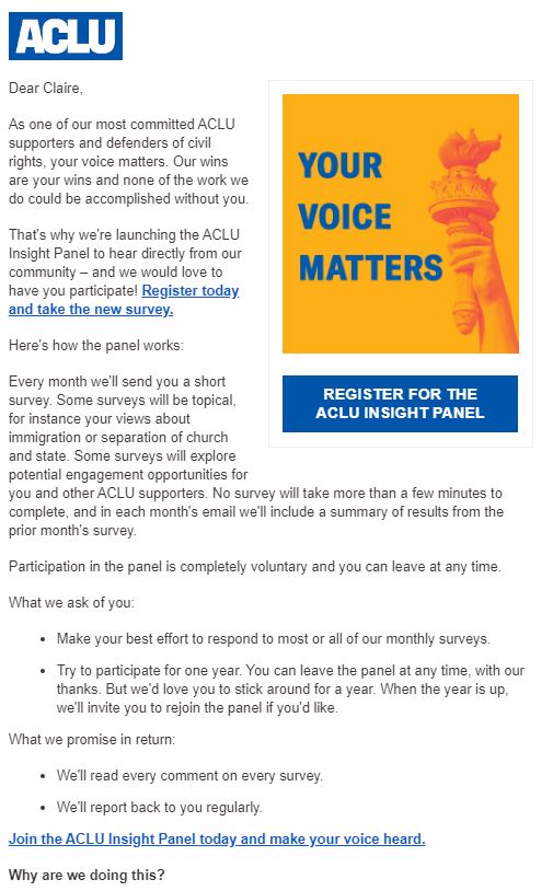
They had me at the first sentence!
In fact, the entire first paragraph makes me feel good.
- I feel flattered they consider me among their “most committed.” And you know what they say about flattery! We tend to like people we perceive like us. It acts as a shortcut to getting folks to do what you want them to do.
- They’ve reinforced our shared values, reminding me why I support them. Speaking to your donor’s why is more important than speaking to their what when it comes to building an ongoing relationship. If instead they’d intimated they valued me for the dollar amount of the gift I’d made, I wouldn’t have felt the same inspiration. Donors care about impact, not money.
- They’ve made me an integral part of their impact, letting me know “our wins are your wins.”
The second paragraph gets right to the point.
It doesn’t take long for me to learn why they’ve sent this email.
- It reminds me they care about my feedback.
- It intimates I will be joining a group – and people are wired towards connecting with community.
- It makes it easy for me to participate. In fact, I can take action right here: “Register today and take the new survey.”
It overcomes any hesitations I may have.
Should I be unsure if I want to join in, they make it clear what is involved as I continue reading.
- I know what’s asked of me. This makes me anticipate feeling good because I’ve been helpful. Did you know MRI research shows people get a ‘feel good’ shot of dopamine when they even contemplate giving? That’s right; asking people to help you is a good thing!
- I understand the benefits to me. It’s not all about them. They promise to listen to me and to report back to me.
- The fact I’m joining a group is reinforced. This is not a one-shot survey. I’ll be asked for feedback every month. I can leave if I want, but if I stick with it they’ll ask me to join again. This feels like a privilege, not a duty.
- It feels exclusive, which makes me feel special. One of Robert Cialdini’s six Principles of Influence and Persuasion is “scarcity.” When something is exclusive, we want it more.
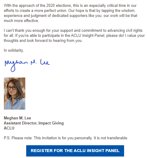
- It feels urgent because of the times we’re in – which they’re careful to remind me of at the letter’s closing (“With the approach of the 2020 elections…”). Psychologically, when you can create some sort of urgency or deadline, you’re more likely to inspire current engagement.
They take advantage of the P.S.
Studies show this is one of the most valuable pieces of real estate you have when sending a letter. Most people will look first at the salutation and right-hand image; next they’ll look at the signatory and the P.S. So it often counts more than the body of the message.
- They use this valuable piece of real estate wisely, reinforcing the exclusivity of joining their Insight Panel: “This invitation is for you personally. It is not transferable.” I love this! Whenever you can tap into the way humans are wired to behave, using principles from psychology and neuroscience, it will give a boost to your fundraising marketing.
There is a clear call to action ‘button’ at the bottom.
- It’s great to have a button both above and below the scroll. This way, at whatever point in your copy the donor gets motivated to act, it’s easy for them to do so without having to scroll up or down.
- It reinforces fact I’m joining a group. Rather than saying “Take the Survey” it invites me to “Register for the ACLU Insight Panel.” Psychologically, this flips me from feeling I’m doing something for them to they’re doing something for me.
- It’s in ‘button’ form so it stands out.
They use an image, caption and call to action at the top.
- Again, it’s good to have the call to action in multiple places.
- A picture can be worth 1000 words, and a picture + caption + call to action can encapsulate your entire message in the blink of an eye. Again, this is valuable real estate you don’t want to waste. And they don’t, but…
What looks not so good?
I have only two little quibbles – and I don’t know if I’m right about it. But I’d test it.
The image they use is not a human face.
In my experience, when you show real people, this improves response. Especially when you show faces. Especially when those faces have eyes that seem to be looking right at you. Somehow, it triggers our empathy. We want to help more when the message goes to our heart, not our head. However… the torch of liberty is iconic and aligns 100% with their mission. And it’s ‘safe’ in the sense there’s no risk the photo will fail to align with the story they’re trying to tell. So it’s not a bad image by any stretch of the imagination.
Still, it’s worth an A/B test.
They might also try a different color CTA button.
They’ve used their corporate color to tie in with their design, presumably. Studies show using a contrasting color makes the call to action stand out more. This results in more folks doing what you want them to do. Again, it’s worth testing whether using another color would make the call to action pop more.
Would it inspire you to click through to the survey?
Yes, it did!
If so, why?
For all the reasons described above.
If not, why not?
Moot point. I clicked.
When You Act, are You Rewarded?
Yes!

They employed a savvy strategy by assuring the opening paragraph of the survey matched the language that inspired me to click through.
- I’m once again flattered. Not only am I their “most committed,” now I also possess “wisdom” and “experience.” Cool.
- I feel I can trust them. This is exactly as promised; no bait and switch.
- I feel secure. They are not going to share my contact information.
NOTE: One additional smart thing they did was the minute I completed the survey I was immediately directed back to their website. Here I could be inspired by more stories of impact. And, who knows, perhaps I might even be inspired to make a monetary donation?
Key Lessons Learned
-
The email subject headline and preview pane matter. A lot. They’re what get your email opened or deleted. It doesn’t matter what’s inside if no one opens what you’ve sent. Here the copy was donor-centric – all about what I think! – plus it aroused my curiosity regarding which of my thoughts might be sought after.
-
The email copy must quickly resonate with the reader. Here I was reminded they know me and know what I value. They flattered me and made me feel good.
-
The email copy must quickly get to the point. The second paragraph told me what I needed to know. Enough so I could take action right now, or continue reading to learn more.
-
Donor centricity is a must. If you don’t first get inside your donors’ heads (Ask: “What will our donors think of this? How will they experience it? What will it make them feel?”), you’ll likely not find the key to their hearts. If you make them like you, and show them how the values your organization enacts are the values they share, you’re more likely to get the action you desire.
-
Using psychological principles of influence is a smart strategy!The ACLU used a number of these – flattery, scarcity, urgency – to their advantage. They also used the human yearning to be connected and be part of a community.
-
Don’t miss a trick. Consider every element of your strategy. Know the most valuable pieces of real estate and use them wisely. Give yourself every possible leg up.
What do you think? Am I off base? Anything to add? Please share in the comments below.
Want More Help with Major Donor Engagement Strategies?
 You may find my 50 Ways to Move Your Donor: Cultivation Solution Kit useful. This e-guide will give you all sorts of handy tips to move from point A to point B to point C – both the tried-and-true familiar moves and the dare-to-try moves that make sense in our digitally connected era.
Like all Clairification products, this comes with a 30-day, no-questions-asked, 100% refund guarantee. I want you to be successful!
Please note: Often I can’t omit the name of the charity in the examples I use. Today’s example is a home run, so hopefully I’ve not offended. Please know I always come from a place of love, and don’t mean to shame anyone. As with almost anything you can think of, there’s good AND bad in the examples I share. We learn both from mistakes and stellar efforts. Our own, and others. Kudos to all who put things out there and make an effort. The only way you learn is by trying. If I ever use you as an example, and you disagree or want to clarify, feel free to contact me directly.


