 Soliciting donations from your supporters is hard work. It requires identifying prospects, building relationships, and ultimately asking them to contribute to your organization.
Luckily, your donation page can do some of the heavy lifting for you!
When optimized for the donor experience, your donation page can help potential new supporters form a positive first impression of your organization and inspire them to contribute.
These five improvements can do wonders by streamlining the online giving process to maximize both the number and size of gifts your organization receives. Let’s get started!
1. Simplify the giving process.
Have you ever tried to send a gift to a nonprofit online and found the process difficult and frustrating?
You’re not alone. In fact, the conversion rate for desktop donation pages is only 16% while the conversion rate for mobile users is even lower at 10%, illustrating the frustration many potential donors face.
To avoid this situation for your own donors, audit your online giving process.
Make a small contribution using your donation page so you can experience the process yourself and identify any areas for improvement. Do this from both your desktop and mobile device. Make notes wherever you encounter problems. Now ask a friend who doesn’t work for your organization to do this. Compare notes.
Here are a few tried and true ways to streamline online giving to encourage donors to contribute larger amounts and more often:
Include suggested donation amounts.
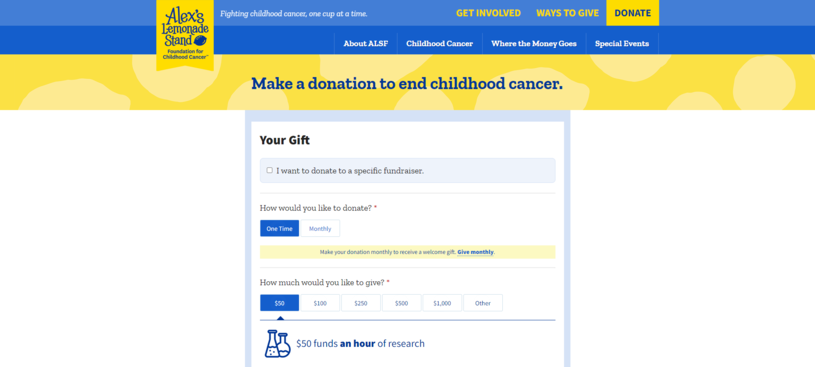
Don’t make people guess how much they should give! When you include your most commonly selected donation amounts on your page, supporters are likely to choose these options and give larger gifts than they typically would. To further encourage giving, you may also attach explanations of what each donation amount will allow your organization to achieve. Check out this example of suggested donation amounts from Alex’s Lemonade Stand’s donation page for inspiration.

Add a recurring gift opt-in.
Allow donors to set up a recurring gift on a monthly, quarterly, or annual basis. Providing this option on your donation page makes recurring giving more convenient for donors, increasing your online revenue as a result. In fact, the average annual value of a recurring gift is 10.3 times higher than the value of the average one-time gift!
Offer the option to offset processing costs.
While some organizations advise against asking donors to offset donation transaction fees, many supporters will be happy to do so. As long as you give donors the option, it can be an effective way to free up more cash flow for your organization.
2. Make your donation page visually appealing.
You know how people say you eat with your eyes?
Just as presentation is a critical part of a diner’s experience, so too are the design elements of your donation landing page a critical part of your donor’s experience. Beyond providing a more streamlined donation process, as described above, you’ll also want to customize the look and feel of your donation form so it attracts, rather than repels, donors.
To make your donation page more visually appealing, you should:
Implement a donation page template.
Start your donation page design on the right foot by using a dedicated donation page template. A template will provide the foundation for your page that you can then customize to your organization. Look for a template with ample white space so it’s not overwhelming for donors and will focus their attention on the task at hand: donating.
Incorporate your brand.
As soon as someone stumbles upon your donation form, they should know immediately that it’s you. Don’t send them to a third-party site that raises their suspicions. And don’t make it look different than everything else you do. Be sure to use your nonprofit’s brand colors, fonts, and graphic style for consistency. Additionally, including your logo on your donation form helps build trust with donors and make them feel confident they’re supporting you—not a random third party or impersonating web page.
Use compelling images.
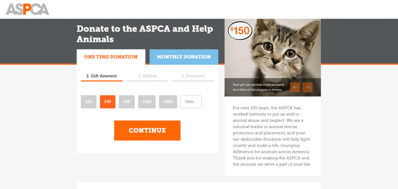
Grab donors’ attention with images and videos that demonstrate the impact of previous contributions. The right picture can speak a thousand words. Quickly. And, remember, most visitors to your donation page are time-starved. So, they scan. Adding an impactful image is a quick way to connect with prospects and show them the value of your organization. You may include photos of beneficiaries, volunteers in action, donors or staff. Accompany them with storytelling elements to help donors build an emotional connection to your cause. For example, the ASPCA includes images of animals their team has helped on their donation page.

If you need additional support developing the visual elements of your donation page, consider reaching out to a nonprofit graphic designer. Using their graphic design expertise and experience with similar organizations, they can transform your donation page so it draws donors in and encourages them to contribute.
3. Ensure your donation page is mobile-friendly.
The majority of nonprofit website traffic in 2023 came from users on mobile devices — 52%, with 48% of traffic from users on desktop devices. While 78% of revenue came from users on desktop devices, increasingly more donors are giving through mobile devices, indicated by a 14% boost in mobile revenue from 2022 to 2023.
As a result, it’s extremely important to make your donation page mobile-friendly. Whether donors look up your organization using a simple mobile search, navigate to your donation page from your social media, or participate in a text-to-give campaign, mobile-friendliness increases the chances they stay on your donation page and follow through with a contribution.
Things to consider.
To ensure your donation page is mobile-friendly, Bloomerang’s donation page guide recommends asking yourself the following questions:
- Are the images clear and fully visible on the page?
- Is the text large enough to be read on mobile devices (16 – 20 pixels for body copy)?
- Are the form fields easy to click on in the mobile view?
- Does the page load quickly (in three seconds or less)?
Based on your responses to these questions, make any necessary adjustments using your content management system (CMS) or online fundraising software.
4. Follow accessibility standards.
Accessible donation pages ensure anyone interested in contributing to your nonprofit can easily do so, regardless of any disabilities they may have. When it comes to web accessibility, the Web Content Accessibility Guidelines (WCAG) are the gold standard.
Follow these guidelines by:
Using colors with sufficient contrast.
Make the text on your donation page easy to read by using colors that contrast starkly with the background. For example, black text on a white background helps those with visual impairments navigate your donation page more easily.
Including alternative text and closed captions.
Adding descriptive alternative text to images helps people who rely on screen readers understand each image’s purpose. Additionally, incorporating closed captions for videos allows individuals with hearing impairments to interpret your video content.
Labeling form fields properly.
Including descriptive text for form fields outside each field allows screen readers to process it and people with visual impairments to fill out your donation form correctly.
Additionally, strike a balance between engaging and accessible graphics. For example, while animations can highlight important elements on your donation page, avoid any strobing or flashing elements that could create a negative user experience or potentially induce seizures.
5. Use the right online giving platform.
If you try to drill a hole with a hammer you’ll never get there. The right tool is essential! That’s why you need an online giving platform that makes it easy to incorporate all of these tips and create a successful donation page.
Things to consider.
Kindful’s online fundraising software guide recommends looking for a provider with the following features:
- Customizable donation forms you can embed on your website
- Donation buttons you can use to direct donors to your donation page
- Recurring giving options so donors can easily set up regular contributions
- Peer-to-peer fundraising tools that allow supporters to create their own fundraising pages and gather donations on behalf of your nonprofit
- Payment processing so you can securely collect online donations via credit card, ACH or other giving wallets
- Donor accounts that allow donors to view their giving history, recurring donations, tax receipts, and event registrations
While not all platforms will have each of these features, they may integrate with other providers to fill in the gaps. Thoroughly research your options and request demos from each provider before making your final decision.
Final thoughts
Your donation page is one of, if not the most, important pages on your nonprofit’s website. As such, it is never “one and done.” Continuously improving this page is well worth your time, as it will provide a positive user experience for donors and maximize your donation revenue.
Remember, forms that are long and laborious will cause donors to give up before they’ve finished filling it out. This is a shame after you’ve successfully driven your donor to this page, and they are ready (almost) to make a philanthropic gift. The best way to avoid sabotaging yourself is to keep your form short and simple, making your pages mobile-friendly, and adhering to the other best practices above.
Consider revisiting your donation page every six months to make sure it’s still functioning properly; update page elements as needed. You’ll cut down on donor drop off and secure more donations. Hooray!
 Megan Allison, guest blogger, has been a Content Marketing Specialist at Qgiv since 2022. She takes pride in helping nonprofits by creating content that shares fundraising tips and tricks, board development strategies, donor acquisition and retention tactics, marketing campaigns, and nonprofit management tools. Plus, she is dedicated to keeping organizations updated on the latest trends in the fundraising world. In her free time, Megan enjoys reading, music, and playing with her two cats.


