Often it’s the little things that make the experience count
The biggest fundraising time of the year for most nonprofits inexorably approaches.
It can be stressful.
Don’t succumb to the stress. You’ve got this!
Perhaps you can’t do everything you’d like to do this year, but you can do some things.
Here are 12 strategies for you to consider. Each will pack a big punch.
Some you can do on your own. Some will require support from technical and/or marketing staff.
Here’s the thing: Often it’s the little things that count. That pack a surprising wallop.
So don’t save all your energy for writing your appeal. Help your appeal along by putting some of the dozen suggestions that follow into effect. Even just one or two will make a difference.
Let’s get started…
1. Send a Thank You
If it’s been a while since you reported back to your donors on the impact of their giving, take time to do so now. Before you send your appeal. This puts people in a grateful and giving mood. And, by the way, #GratitudeTuesday is a great opportunity to say thanks and give back. If you’re going the more traditional #GivingTuesday route, at least be sure to plan ahead to shower these donors with love. It’s a great way to predispose them to give again when you send your year-end appeal.
2. Make Your DONATE Button Stand Out
Make sure it’s big, bold and easy to find. This may seem obvious, but many nonprofits blow this opportunity to drive more philanthropic giving. You may think it’s unseemly to call too much attention to it. Well… it’s a lot more unseemly to let people who rely on you down because you failed to raise the money needed to fulfill your mission.
- Put it at the top so it stands out. Ideally, in the upper right-hand corner. That’s where people will look, as that’s become the custom.
- Put it in a color that contrasts with your branding colors. Don’t make it so “tasteful” that it blends in with the woodwork. And use color psychology to inform your choices. Generally, orange and green perform best – but not if these are your corporate colors.
- Try an irregular shape. One theory on Call to Action buttons holds that such shapes are subconsciously more appealing than regular rectangles and ovals. Just make sure it won’t be mistaken for a graphic element – so not too cutesy.
- Make it big enough to be touched when folks are using a phone or tablet. Make sure it’s tappable by a thumb.
- Put it on every page.
3. Tweak Your Donation Landing Page
Verify your trustworthiness.
Not seeing trust indicators can deter donors. Add something to show your credibility, such as:
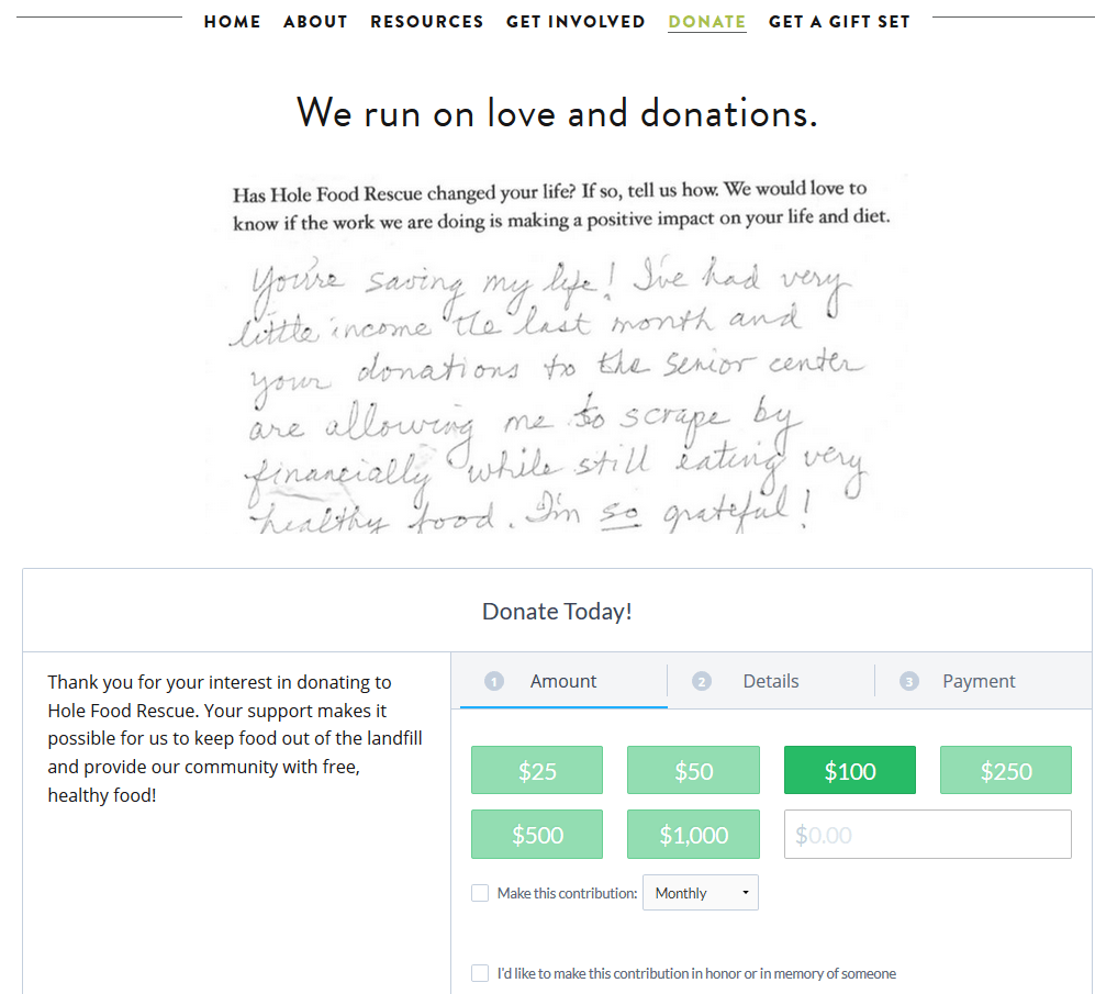
- Testimonial (e.g., from an influencer, donor or client). I love this handwritten one on the Hole Food Rescue website:
- Charity watchdog rating (e.g., Charity Navigator, give.org, Charity Watch, Guidestar)
- Verified encryption security
- Lockbox icon (NextAfter conducted research showing this one thing increased donations by over 14%)
Add a story.
The human brain is wired for storytelling, and folks will be more receptive to a story than data. Make sure your story demonstrates how the donor’s gift will help, and will give the story a happy ending. Donors want to be the heroes who save the day!
Include a photo.
It’s worth 1,000 words, and it’s something that will “stick” with the donor and reinforce the message of your appeal. Images are processed 60,000X faster in the brain than text. Since people have an attention span of 8 seconds, it just makes sense to use images or videos consistent with your year-end campaign messaging so your landing page is an extension of your direct mail or email.
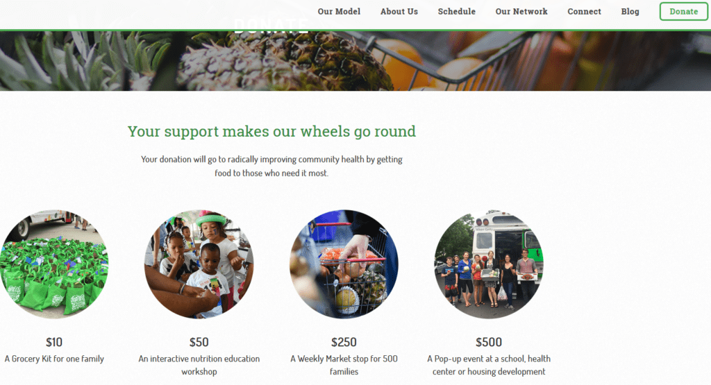
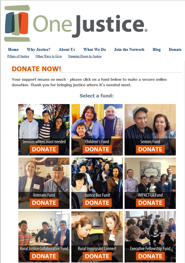
TIP: You can even add a photo to your donation button!
- See this example from Fresh Truck.
- See this example from One Justice.
Make sure you reference your current campaign.
The holiday giving season is no time for a generic donation landing page. If you’re not going to create a specific campaign landing page (if for some reason your software won’t allow it), at least:
- Tweak the copy to add a specific year-end call to action, and
- Add visuals that match your mailed appeals.
TIP: Change the settings of your online donation form and increase the suggested donation amount(s). At holiday season, donors tend to increase the amount of their gifts. (And set a reminder for yourself in early January to change the settings back.).
4. Take Over Your Home Page
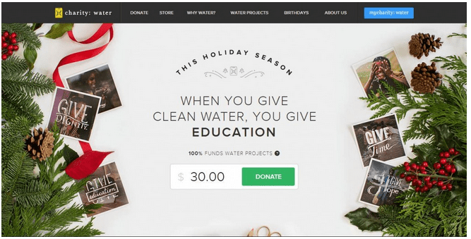
There’s nothing more important to your visitors on certain days of the year (e.g., Giving Tuesday; December 25 – 31st) than giving. So why not make your appeal the centerpiece of your Home Page on those days?
- Here’s an example from Charity Water.
5. Consider a Light Box or Pop Up Splash Page
The form-based box that pops up over a website with a call-to-action is called a Light Box (or Splash Page). It generally pops up the first time folks come to you during the period for which you set it up – perhaps just for one day on Giving Tuesday; perhaps during the 4 – 6 weeks you’re running your year-end campaign. You can tinker with how often a visitor might be shown the light box (the best advice I’ve heard is if your visitor dismisses the popup, don’t show it to her again for at least a week).
You or your leaders might find them annoying. But they work. Why? It’s a simple matter of eyeballs. Conversion rates go up because more people will see your call-to-action. They can’t help but notice it, because you’ve put it right in their faces. The first time I used one of these, when I was Director of Development at the San Francisco Food Bank in 2010, it increased online donations during that period by almost 30%. This may/may not work for you, but it’s worth testing.
See this example from Chesapeake Bay Foundation.
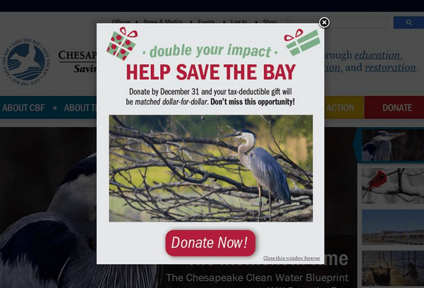
Consider a delay in pop-up timing. Most pop-up software will let you customize when your pop-up appears. You can create one that appears only after the reader has been on your site for a set period of time. For year-end, I’d suggest having your pop-up timed right away, but you can test and play with the timing if your bounce rate spikes or you are fielding complaints.
TIP: There are tutorials on how to code light boxes on YouTube.
6. Promote Monthly Giving
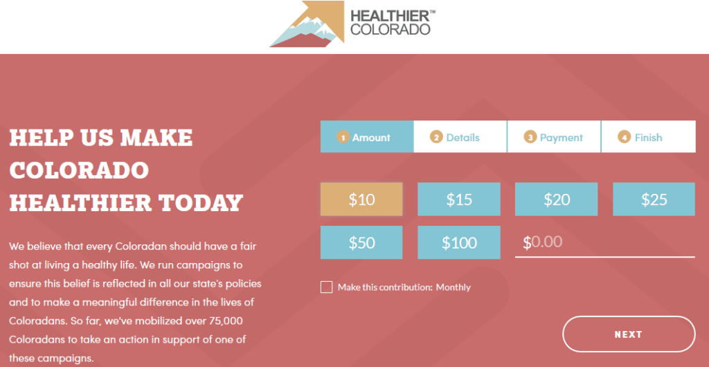
Monthly donors renew at an average 90% rate vs. a 46% rate for annual givers (see Fundraising Effectiveness Project and Network for Good research). Therefore, your goal over time should be to make giving to you on a recurrent basis the norm, rather than the exception. Begin by making it easy and attractive. Spotlight monthly giving everywhere:
- On your online donation page (see this example with a simple checkbox to convert your gift to monthly, from Healthier Colorado)
- On your website
- In your email appeal
- In your mailed appeal
- In your newsletters and blog
7. Promote Tribute Giving
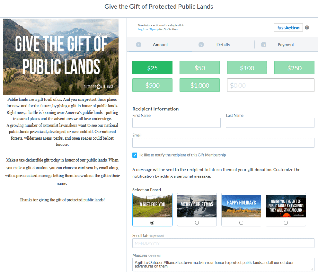
Being donor-centered means helping your supporters whenever you can. During the holidays, many folks are thinking about making gifts to friends and family. You can make it easy for them by offering the option of a check-off box to indicate they’d like their gift to be made in honor or memory of loved ones.
Here’s an example from Outdoor Alliance that also includes the option of sending an e-card.
8. Eliminate Donation Form Clutter
The more fields your donor must fill out, the less likely they’ll complete their transaction. If you don’t really need the information, don’t ask for it.
And make sure when they click on “Donate” from your Home Page they’re taken directly to your Donation Landing Page. Don’t take them to a page that explains your mission, or describes all the different forms of giving (do that on a drop-down menu instead). The more you distract folks, the less likely they are to act.
TIP: NextAfter conducted research finding eliminating the following increased donations 195%: Other menus. Other ways to give. Other ways to get involved. Social media icons. Multiple action items.
9. Improve Mobile Responsiveness
Make sure your website, donation landing page and email are easy to read and use on any device, including a smart phone and tablet. It’s likely at least half of your would-be supporters will open your appeal there first. If they can’t find what they want, or it’s too hard to navigate, many won’t return. To successfully compete in today’s philanthropic landscape, you have to be optimized for mobile.
10. Enable Sharing
Do what you can to pour gasoline on your donor’s burning fire; don’t douse it with water. Sometimes when people do a good deed, they like their good deed to spread — through alerting their friends. Especially if they’re passionate about your cause. Make it easy for them by proactively asking donors to spread the word by putting share buttons where they belong. Not on your Donation Page, but on your:
- Thank you/confirmation page.
- Thank you emails and social media
11. Add an Email Signature
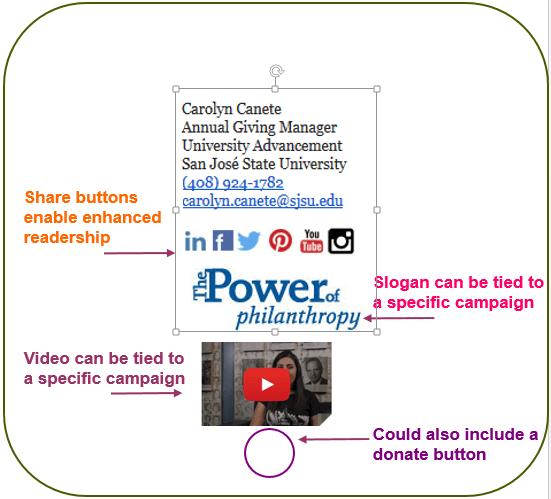
This is one of the easiest things you can do to share your campaign broadly. Simply include a link to your donate button in your email signature. And while you’re at it, include connections to your social media sites and YouTube videos. Maybe even include a link to a thank you video!
Don’t just have development staff do this. Ask everyone — staff and board and other volunteers — to share the love! Here’s an example from San Jose State University (they missed one trick – the donate button – but you can see how easy it would be to add).
12. Make Sure Your Ask is Donor-Centered
Don’t say “it’s annual giving time again, so please make a gift.” This is SUPER important! Make the ask about your donor and what they might hope to accomplish, not about you or your organization. Don’t say “give to our GivingTuesday campaign.” Don’t say “help us meet our fundraising goal.” These asks are all about you and your process.
Donors don’t care about how you do things and what you think is important. They don’t care about your monetary goals. They don’t care about your deadlines.
Donors care about what they can do to make a specific impact. Use action words that encourage them to help, heal, rescue, save and change the world in a manner that’s near and dear to their hearts.
You’ve still got time to do a few things that will most definitely improve your year-end fundraising results. While you may not be able to do all these things this year, surely you can do at least one. Pick what works for you — and see what happens!
I’d love to hear your results.
Want More Year-End Fundraising Tips?

63 pages filled with year-end fundraising tips in this comprehensive Solution Kit
Get my Year-End Fundraising Solution Kit. It’s filled with tips and checklists to assure you don’t miss a trick. Everything you need to assure you get, and keep, the most donations possible this year. Not satisfied? All Clairification products come with a 30-day, no-questions-asked money-back guarantee.
Photo by Blake Meyer.
A version of this article was published on Clairification November 14, 2017
-
Pingback: Your One-Stop Guide to Year-End Giving >> The Brick Factory
-
Pingback: Ultimate Guide to Last Minute Year-End Fundraising Strategies
