 I’m continuing with my new, occasional feature of “Do’s vs. Don’ts.” Whenever something arrives in my mailbox that seems a good ‘teaching opportunity,’ my plan is to share it with you. Please let me know if you find it useful!
Today’s example is an email that includes a link to download this organization’s new strategic plan.
I’m a past donor, so I’m assuming that’s why I received it.
Do you think it’s a “Do” or a “Don’t?”
What’s wrong or right with the subject line?
The email arrived with the headline: “Claire, we have big, exciting news to share with you!”
The preview pane continued: “Announcing Opportunity Fund’s bold 5-year strategic plan and a new key partnership…”
-
Would you open that email?
-
If yes, why?
-
If no, why?
I’ll tell you my own thoughts in a moment. But first…
Think it through yourself because you’ll get more out of this if you do.
Seriously, I mean it. We learn best by doing.
This may help: Take five minutes and jot down your answers to the following questions on a piece of paper or your screen.
-
What’s compelling about the subject line?
-
What’s off-putting about the subject line?
-
Does it inspire you to open the email?
-
If so, why?
-
If not, why not?
Okay. Have you answered these five questions?
Go back to the initial three questions now.
Answer them.
Done?
Okay, good. We’ll get to my thoughts in a moment.
First, let’s continue with what happens if and when you do click and open.
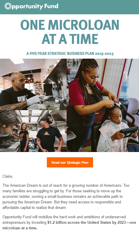
What’s wrong or right with this picture?
 It’s time for a few more questions.
Grab that pen or keyboard again.
-
What looks good about it?
-
What looks not so good?
-
Does it inspire you to give?
-
If so, why?
-
If not, why not?
Please take 10 minutes or so to think this through. There’s a good deal to notice here. You’ll likely figure out a lot on your own. And some of it may make you think about things you might do differently with your own emails moving forward.
Then there will be a few things you don’t think of, and those will be the nuggets you’ll learn even more from!
Okay. Ready to know my answers?
1. Would you open that email?
This headline, for me, is a 50/50 toss-up. I’m somewhat intrigued about what their big exciting news might be. However… I haven’t donated for a year or two, so I may have moved on as far as they know. Something more donor-centric than “we have news” might be preferable. Because I don’t necessarily care about their news.
And then there’s the preview pane informing me their news is about their strategic plan. That’s not, frankly, something most donors care much about. Unless they’re committed loyal donors and/or volunteers.
Perhaps the preview pane could say something like “Look at the future your donations will make possible!”
2. If so, why?
I’d open it if I knew and loved you. Again, I haven’t donated recently, so am not sure if this email was sent to everyone on their mailing list, regardless of how devoted or loyal. [Full confession: They’re a former client, so of course I was going to open it to see how they’re doing.]
I also might open it if I was having a really boring day and couldn’t resist opening some “exciting news.” It’s not a bad idea to share “news.” In this case, I’d eliminate the word “we” and perhaps rewrite it slightly (e.g. “Claire, are you ready for big, exciting news?” or “Claire, are you ready for big, exciting news about reducing income inequality in our community?”)
I might open it if I’m really interested in seeing their strategic plan. Again, this would be because I read about this in the preview pane. Could it have been better written? Perhaps an improvement might be “Review Opportunity Fund’s bold 5-year strategic plan to learn how.” But remember that not everyone has their email inbox set up to display the preview pane. And that’s especially true if they open their emails on a mobile device.
3. If not, why not?
The headline doesn’t resonate with anything I care about. Board members, committee volunteers and major, loyal donors are the most likely to care about their exciting news. So this may be a compelling headline for these folks. What might have been better for less engaged folks like me? Perhaps “Exciting news about how you’re helping hard-working people take charge of their economic future!” Or perhaps” Exciting news and a plan to reduce income inequality in our community!”
4. What looks good about it?
BOTTOM LINE: Once the email recipient opens this email, there’s a lot to like.
- The headline states the mission in a nutshell: “One microloan at a time.”
- The photos reinforces the headline by showing the people being helped to start new businesses.
- The lead paragraph resonates by tapping into an issue that’s much in today’s news.
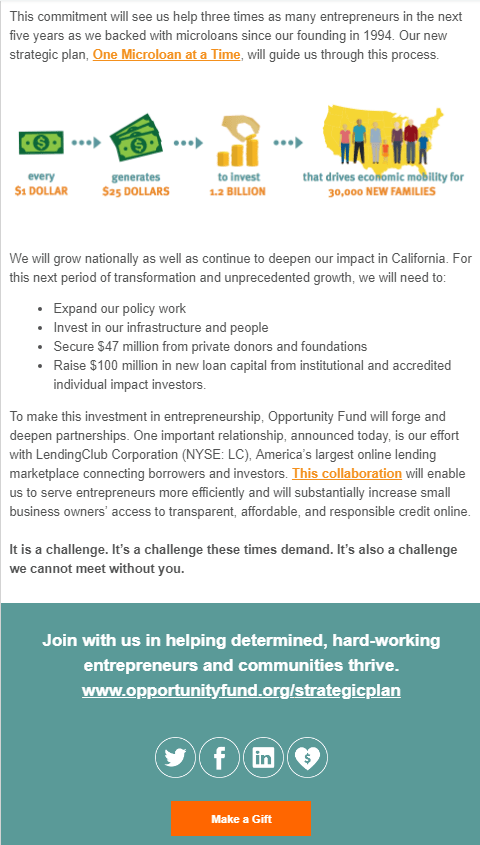
- The infographic shows how a donor’s gift is leveraged so that by investing with Opportunity Fund I see I can make a bigger impact than I could make on my own.
- The overall impression is one of a successful, well-managed organization where I can trust my money will be put to effective use.
- The announcement of a new collaboration serves as “social proof” – a testimonial to the fact this organization is leading the way.
- The donate button at the bottom stands out in a contrasting color, and it restates the specific purpose to which my gift will be applied.
Frankly, I pretty quickly clicked through to download the strategic plan – and I was blown away. I’m sharing the link with you HERE because it’s one of the best examples I’ve seen of, essentially, a series of compelling mini case statements that cogently outline the why and what of all their strategic initiatives for the next five years. I could spend an hour webinar addressing all the things this so-called plan (which is really more of a carefully crafted, compellingly visual impact statement/fundraising pitch than what you might think of as a usually dry as dust ‘term paper’ type of document) does right!
The vision, mission and values shine through, and it’s clear what a donor’s gift can accomplish. Everything is clearly laid out, in outline form: Problem; Solution; Opportunity. And the icing on the cake are the compelling stories and photos sprinkled throughout. Well done!
5. What looks not so good?
It’s a little bit long and a little bit wonky. Generally, I recommend brief, succinct emails that don’t require the reader to scroll down. But there’s an exception to every rule.
In this case, it’s okay because they had enough interesting stuff to say. Plus it’s well laid out so it doesn’t tire the reader’s eyes or overly tax their patience.
6. Does it inspire you to give?
Not by itself. That’s because the purported purpose of the email is to share a plan. I don’t know that the primary purpose of this email was to inspire a gift. Rather, I suspect it was more about warming up potential major donors. And I will say the plan itself did an excellent job in that regard. I find it highly likely that if they now work through their major donor portfolio, setting up meetings with them to get their feedback on this plan, they’ll raise a lot of dough.
Interestingly, I’d received a ‘pure’ fundraising email** from them the week before that made an effective, inspirational pitch. Please note I don’t think they’re sending too much email. Most organizations send too little email. If you do it well, donors will be happy to hear from you. Which is preferable to “out of sight, out of mind.”
**I’ll share that fundraising email at the bottom of this post so you can see a good example:
7. If yes, why?
I might give if I’m a current supporter and haven’t given yet this year. I might even make an additional gift. As noted, the email makes a compelling case for being affiliated with this smart, forward-looking organization.
8. If no, why?
The strategic plan email is not really a fundraising email per se; it’s more of a set up for a major donor appeal down the line (IMHO). The “make a gift” call to action is not the only call to action. I also have the opportunity to click to download the plan. Or to click to learn more about the collaboration. For a fundraising email, you want just the ONE call to action.
**Here’s the promised ‘good example’ fundraising email:
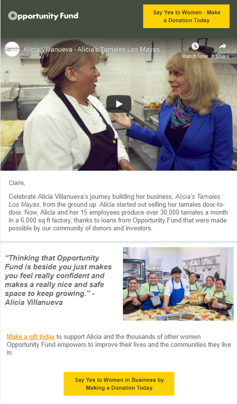 And here’s the URL so you can watch the video: https://www.youtube.com/watch?v=5QFQdXr26uE&feature=youtu.be
- It’s brief and to the point
- It leads with a success story
- It’s got a photo
- It’s got a video
- It’s got a client testimonial
- It speaks to an issue much in today’s headlines
- The donate button appears twice, at the top and the bottom, and there are no other distracting calls to action
Remember: No matter how outstanding your content is, if you don’t inspire folks to open it all your hard work will go to waste.
What do you think? Am I off base? Please share in the comments below.
Want More Appeal Writing Help?
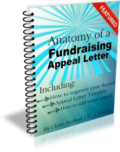 Check out Anatomy of a Fundraising Appeal Letter + Sample Template. This simple, yet incredibly thorough, 62-page step-by-step guide to crafting a killer appeal will help you whether you’re a pro wanting new tips, or writing an appeal for the first time. Take your next mail or email appeal from anesthetizing to astounding. From colorless to captivating. Rock these tried-and-true tactics to get your appeal to the next level.
You can’t lose! All Clairification products come with a 30-day 100% money-back guarantee, no questions asked.
As with almost anything you can think of, there’s good AND bad in the examples I share. We learn both from mistakes and stellar efforts. Our own, and others. Kudos to all who put things out there and make an effort. And a big high five today to Opportunity Fund!


