 I’m continuing with my new, occasional feature of “Do’s vs. Don’ts.”
Whenever something arrives in my mailbox that seems a good ‘teaching opportunity,’ my plan is to share it with you.
Please let me know if you find it useful!
Today’s example is an emailed invitation to a donor appreciation luncheon.
Do you think it’s a “Do” or a “Don’t?”
What’s wrong or right with this subject line?
I received an email with the headline: Want to enjoy lunch with our kids next Thursday?
The preview pane continued:“You’re invited to our Donor Appreciation Lunch, June 27th! Boys and Girls Club of Maury County.”
-
Would you open that email?
-
If yes, why?
-
If no, why?
I’ll tell you my own thoughts in a moment. But first…
Think it through yourself because you’ll get more out of this if you do.
Seriously, I mean it. We learn best by doing.
This may help: Take three minutes and jot down your answers to the following questions on a piece of paper or your screen.
-
What’s compelling or off-putting about the subject line?
-
What’s compelling or off-putting about the preview pane copy?
Okay. Have you answered these two questions?
Go back to the initial three questions now.
Answer them.
We’ll get to my thoughts in a moment.
First, let’s continue with what happens if and when you do click and open.
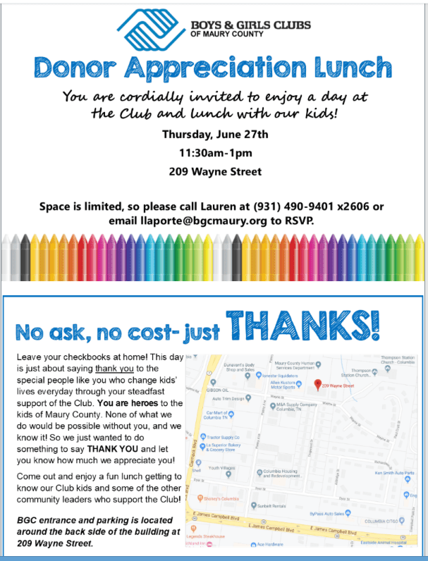
What’s wrong or right with this picture?
 It’s time for a few more questions.
Grab that pen or keyboard again.
-
What looks good about it?
-
What looks not so good?
-
Does it inspire you to attend?
-
If so, why?
-
If not, why not?
Please take 10 minutes or so to think this through. There’s a good deal to notice here. You’ll likely figure out a lot on your own. And some of it may make you think about things you might do differently with your own email invitations moving forward.
Then there will be a few things you don’t think of, and those will be the nuggets you’ll learn even more from!
Okay. Ready to know my answers?
1. Would you open that email?
This headline, generally, is a winner. It’s written in question format, which is always an attention grabber. Plus I see I’ll get to meet service recipients, and that sounds better than hearing dry, canned speeches from staff. However… the weird part is that I’m not a donor, so I’m kind of wondering why I received this?
It makes me wonder if the real reason I’m receiving this is they plan to follow up and ask me for a donation afterwards. And, since I attended for free, I’ll then feel guilty enough I’ll have to become a donor. And, even if that’s not their plan, I feel I may have received this in error and I’m not really entitled to attend.
So… assuming I decided I wanted to attend, I might consider making a donation now. However, there’s nothing to click on that takes me to a donation button or donation landing page. I can see they want this to be a ‘pure’ thank you, which I applaud, but if they’re sending it to folks who haven’t given, there must be an easy way for us to give so we feel that ‘thank you’ is deserved.
The preview pane informs me I’m invited to an appreciation lunch. That sounds nice!
2. If so, why?
I’d definitely open it were I a donor because it asks if I want to meet charitable beneficiaries and it’s clear it’s not asking for money. So there’s nothing threatening about it, and I’m interested in who I might get to meet. Plus it sounds like it might be fun (especially if I’m not busy on Thursday).
3. If not, why not?
Problem #1: Again, I’m not a donor. So this is a disconnect for me and makes me a bit suspicious. How can I be appreciated for something I haven’t done? It would have been SO much better had they segmented their list and sent a different email to non-donors. Or, maybe, have simply restricted this to donors; then followed it up with an email, blog post or e-news article including testimonials from some of the kids and/or a video link to part of the program; then suggesting they hope to see me at next year’s event. Of course, a donate button would be prominent.
Problem #2: It’s not much notice. Maybe they sent a previous email I didn’t notice, but there’s no hint here that’s the case. So it could have a backlash effect of making me feel they don’t quite have their act together. In fact, I may actually be disappointed because I’d really love to attend, but I’m already booked that date/time. So, instead of feeling good, I feel bad. Uh, oh.
4. What looks good about the invitation?
BOTTOM LINE: It’s a ‘DO.’
- The headline states it’s about APPRECIATION: Can’t quibble with that!
- The language is inviting: “You’re cordially invited to enjoy ‘a day at the club’” sounds so nice!
- Noting space is limited creates a sense of urgency and triggers one of the psychological triggers that inform human decision-making: Fear of loss or FOMO (fear of missing out).
- It’s clear this is a pure thank you event, and no solicitation will take place. You want a mix of non-solicitation engagement strategies to balance out your communications. Some give and take, so to speak. Generally more give, less take. For every appeal, send 3 – 7 pieces of wooing content that ask your donor to engage in some meaningful way or provide other value.
- It recognizes donors as heroes, which is a donor-centered perspective. Much better than “See what we did because you gave.”
- Contact information is offered to RSVP to a specific person. This is preferable to “development associate” or “development@” or “admin@.”
5. What looks not so good?
Though it’s an overall winner, there’s always room for improvement.
- There’s no compelling photo of cute, happy kids. These are the absolute best type of photos to have (except for kittens and puppies) and these folks have them, but aren’t using them. Instead they use an image of crayons to make us think about happy kids. It works, and it’s attractive from a design standpoint, but… It’s the kids I want to meet, not the crayons.
- Valuable space is taken up with a map. Nothing should be included in your email that doesn’t inspire folks to take your desired action response. Folks today can easily search and get directions to your location. Or you could provide a map with a confirmation landing page or email. Why not use this space for a photo of a kid, perhaps with a brief testimonial like “I love going to the Club after school and getting help with my homework.” That way you could have your crayons and photo too!
- There’s no way to click and easily respond online, yet this is an online invitation. Requiring people to take an extra step, even one as simple as typing in your email address to RSVP, creates a response barrier. “Click here to attend” would be a useful addition.
6. Does it inspire you to attend?
Somewhat. It would be better if I could click on a link that says “Please count me in” or “Please save my space,” and then be taken to a landing page that includes a few more details about the flow of the event. Or these details could be fleshed out a bit more in the invitation proper. The more a donor can visualize what will happen, the easier it is for them to picture themselves there. Will the kids be sitting at tables with donors? Will they be doing something as part of the program? Will there be a reception beforehand?
7. If yes, why?
Because it’s free, it looks interesting, I’m not otherwise engaged, and I might meet some like-minded people. People are often looking for ways to connect and feel part of a tribe, family or community. That’s why this language is terrific: “Come out and enjoy a fun lunch getting to know our Club kids and some of the other community leaders who support the Club!”
8. If no, why?
I’m not a donor and don’t feel I’m entitled to attend.
What do you think? Am I off base? Please share in the comments below.
Want Some Appeal Writing Help?
 Check out Anatomy of a Fundraising Appeal Letter + Sample Template. This simple, yet incredibly thorough, 62-page step-by-step guide to crafting a killer appeal will help you whether you’re a pro wanting new tips, or writing an appeal for the first time. Take your next mail or email appeal from anesthetizing to astounding. From colorless to captivating. Rock these tried-and-true tactics to get your appeal to the next level.
You can’t lose! All Clairification products come with a 30-day 100% money-back guarantee, no questions asked.
As with almost anything you can think of, there’s good AND bad in the examples I share. We learn both from mistakes and stellar efforts. Our own, and others. Kudos to all who put things out there and make an effort. And if I ever use you as an example, and you disagree or want to clarify, feel free to contact me directly. Just trying to help — and a big high five today to the Boys and Girls Club of Maury County!


Another often-overlooked way to improve subject lines is to put the critical part first. Cell phones cut off the subject lines beyond the first few words.
Instead of:
Want to enjoy lunch with our kids next Thursday?
Maybe:
You’re Invited! Lunch with our kids next Thursday
Great comment. Thanks Louis!
I really enjoyed this feature! I hope you’ll continue doing these with more real-life examples and thorough discussion about what works or doesn’t work for you; I didn’t always think similarly with your responses, so having this new perspective is great.
Can I suggest including a line about who sends the email? I wouldn’t open an email about joining kids for lunch if it were from The Red Cross, for example, but knowing it came from the Boys & Girls Club (or even a person I had interacted with at the org) is totally different!
Totally agree. Good point!
Overall I like the casual feel and the chance to meet some of the kids. I disagree with your preference for a photo of the kids; that might feel like an invasion of privacy and besides it’s hard to have one photo that shows the diversity level of the crayons.
What’s missing is story-telling or a chance to do something meaningful at the event. What would make the event worthwhile for the kids, so they aren’t just on display? Will there be some time for a genuine one to one conversation or just light, perhaps trivial, conversation around a table?
Thanks for sharing Jane. Regarding images, here are some wisdom from direct-mail guru Jeff Brooks:
“I’ve found the following usually (but not always) to be true of the most compelling fundraising images:
Color is better than black and white. (There’s also a meaningful budget consideration to this one.)
Eye contact with the subject is good.
One person is better than lots of people.
People work better than things.
Stock photography seldom works well.”