 Here comes my occasional “Do’s vs. Don’ts” feature, where I share with you something arriving in my mailbox that seems a good ‘teaching opportunity.’
Today we’re going to review a monthly donor campaign strategy.
It arrived as an email. There’s (1) a subject line, (2) the email itself, and (3) what happens if/when you click through and are transported to the donation landing page.
We’ll take a look at the various elements; then assess what works/doesn’t work.
I’ll ask you some questions.
- Would you open this email?
- If yes, why?
- If no, why?
- What looks good about the email?
- What looks not so good about the email?
- Would it inspire you to click through?
- If yes, why?
- If no, why not?
- Once you click through, would you be inspired to take action?
- If yes, why?
- If no, why not?
First, I’d like you to think about your answers and jot them down.
Second, I’ll tell you what I think.
Third, if you disagree with me please let me know in the comments below.
Really take the time to notice what you like and don’t like.
I promise you’ll learn a LOT more this way. We learn best by doing.
Seriously, I mean it.
Let’s begin at the beginning.
Subject Headline
Claire, here’s a simple way to do your part to repair the world.
This may help: Take three minutes and jot down your answers to the first three questions on a piece of paper or your screen. I want to know if what was in the subject headline would have caused you to open the email or hit ‘delete.’
Okay. Ready to learn what I think thus far, and also see what else we’re working with?
Let’s begin!
Does this Email Say “Open Me?”
What’s wrong or right with this subject line?
Claire, here’s a simple way to do your part to repair the world.
Your email subject line and preview pane are the online equivalent of the direct mail envelope. You need to begin a conversation and/or arouse curiosity.
This subject line did the latter exceptionally well and totally worked for me.
- They addressed me by first name, which is personal and familiar.
- They spelled my name correctly.
- It aroused curiosity… what might I be able to do that was nice and simple?
NOTE: If you’re still using formal salutations, it’s time to stop. Unless you know someone (1) prefers to be addressed by a title (because they told you so), or you’re dealing with (2) someone in the military, (3) a government official or (4) a member of the clergy, use the first name. Even most kids address their teachers by first name these days (unless, perhaps, they’re enrolled in a parochial school.) Also, when you get new donors, ask them if they have a preferred nickname. Make sure you do this with volunteers too. Enter this into the salutation field in your donor database. There’s nothing less personal than continually calling Trudy “Gertrude” or J.R. “John Robert” – especially if you see them regularly!
Try to stay away from institution-centered words like “we,” “our,” “us,” and “your organization’s name.” In this case, something like “Your voice matters – please share your thoughts today” or “Make your voice heard” might be a bit more donor-centric.
Does This Email Message Inspire Action?
What looks good about it?
Again, I beseech thee to take a few minutes to think this through yourself before you look at my thoughts.
What do you especially notice?
What do you like? Not like?
Don’t cheat and scroll down to what I have to say.
You may disagree, and I’d love to know your thoughts. Your thoughts matter!
Okay?
Ready?
Here’s what I think…
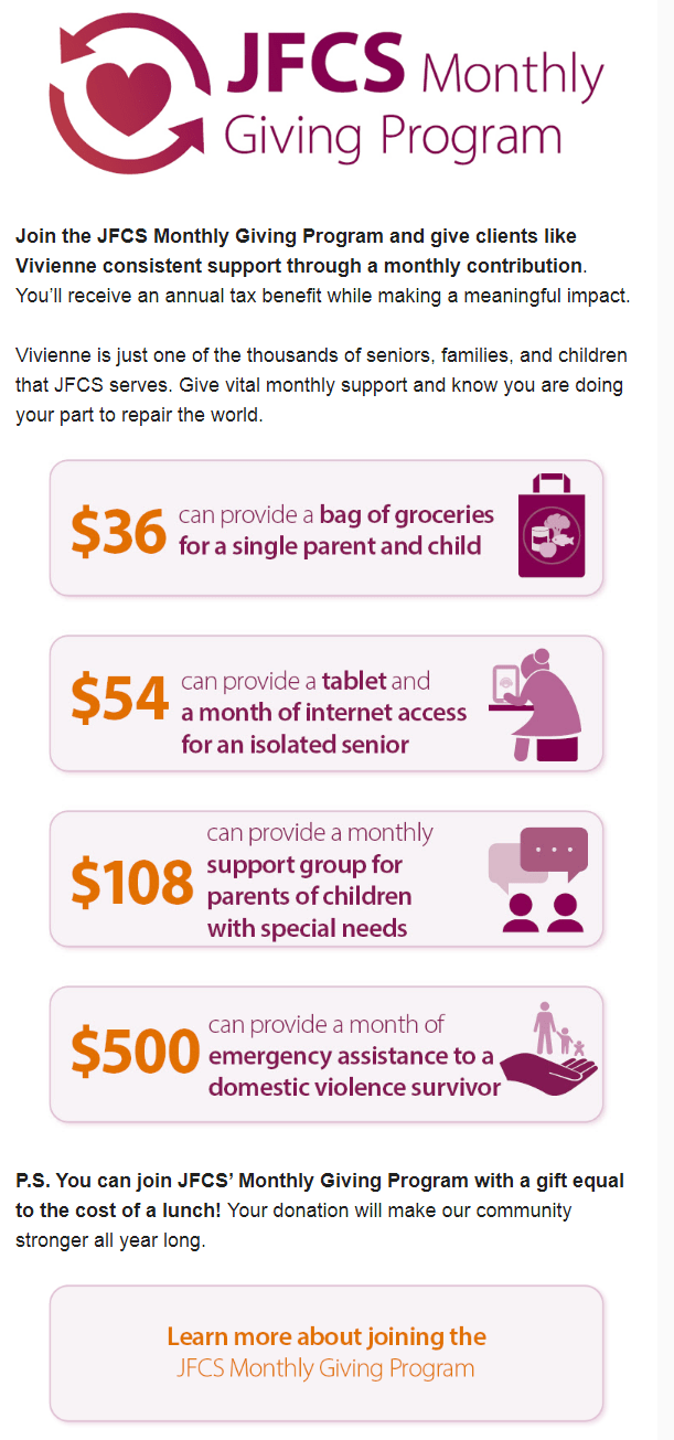
1. They begin with gratitude and making me feel part of community!
DO: It starts out great. The first paragraph makes me feel good and helps me consider ways to be an even better contributor to community welfare.
- I feel good they’re grateful to me. It’s a type of flattery. And you know what they say about flattery! We tend to like people we perceive like us. It acts as a shortcut to getting folks to do what you want them to do.
- They reinforce our shared values, reminding me why I support them. “Repairing the world” is a commandment to which those of the Jewish faith are called. It may be something we forget or neglect to honor on a daily basis, so the reminder puts me in a giving frame of mind.
- They suggest I can fulfill my responsibility in just a few minutes. For folks constantly feeling they aren’t doing enough to be part of the solution, this is appealing.
- They suggest my support can go further through a monthly gift. We all like a little leverage. So the idea my gift might have a ripple, ongoing impact intrigues me.
2. The second paragraph begins a compelling story, getting right to the point and problem.
DO: It doesn’t take long for me to learn why they’ve sent this email.
- It’s easy to see someone I know and love in Vivienne, making me want to take care of her.
- It’s easy to imagine myself as Vivienne one day, making me want to assure this resource is always here — just in case.
- It makes it easy for me to participate. In fact, I can take action right here: “Register today and take the new survey.”
3. The third paragraph continues the story, describing the needed solution to the problem.
DO: I see right away there’s a specific solution I’m being asked to be a part of.
- It intimates I am/will be joining a group of helpers – and people are wired towards connecting with community.
- It describes how the impact of support feels, bringing to mind for me the Maya Angelou quote that what people do and say pales in comparison to how you make them feel. That’s what they remember. And here my gift will take Vivienne from crying in fear to crying in relief.
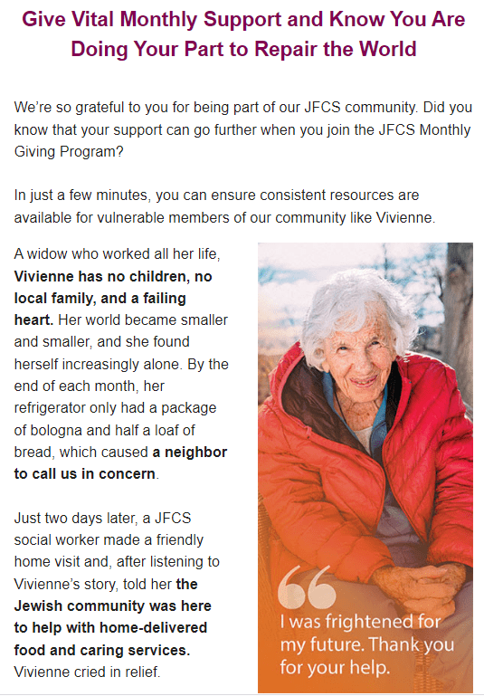
4. The use of a compelling photo (one person looking straight at you) combined with a caption is powerful.
DO: Most people will look at images before everything else and, as they say, they’re worth 1,000 words. Add a caption that makes your case for support, and you need very little else. What’s great here is: (1) a compelling headshot looking straight at the viewer, which captures emotional connection; (2) large size (more than 40% of page width is a good guideline; (3) high resolution (not pixelated), and (4) the caption adds needed context, plus assumes the best in the donor by thanking them in advance.
DON’T: This could be strengthened in a couple of simple ways.
- Add a bit more specificity around both the problem and solution to the caption (e.g., “I was frightened for my future after my husband died. You looked out for me.”). This information is clarified in the text, but… not everyone reads the text. Appeals need to work for skimmers and scanners, as well as readers.
- Choose a photo that demonstrates the problem, not the solution. Generally, sad photos or photos of people being helped (e.g., a home help aide giving food, helping with a walker, giving a big hug, etc.) work best in appeals (show a problem you hope the donor will want to address) while happy photos (show the solution the donor made possible) work well in thank you’s and reports. This isn’t a hard and fast rule, so don’t argue with me if you’ve raised money with happy photo appeals. I have too. It’s just something well worth testing for yourself — because maybe you could be raising even more money! [See more here about (1) how to choose compelling photos and (2) the impact of using images in email appeals.]
NOTE: Only test one variable at a time. If you change the caption, don’t change the photo. Otherwise you won’t know what caused one version of your appeal to outperform the other.
5. The middle part of the appeal, where they show what a monthly gift buys, bogged me down.
DO: It’s not terrible, but could be better.
- Asking me to join to give consistent support works. It makes the important point this is not a one-time, band-aid solution.
- Telling me what a gift at different amounts buys is effective. This creates a logical ask string, and this helps the donor know how much you’d like them to give. This makes giving easy for the donor — always a good thing!
DON’T: These are little mistakes, yet they do make a difference
- Calling Vivienne a “client” distances me from her. Let’s call her a person. Or perhaps a senior.
- Noting I can get a tax deduction is not the primary reason I give, especially smaller amounts. Emails are short and all real estate is valuable. I’d maybe include this on the donation landing page, but not here.
- The purpose for which different size gifts are asked should be related. Ask strings that say $36 buys groceries for one person for a week; $54 buys groceries for two people for a week; $108 provides groceries for a family of four for a week; $500 buys groceries for a family for a month make it easier for donors to pick an amount. They don’t get sidetracked evaluating the different purposes, nor do they give you just $54 (even when they were originally thinking in the $100 range) because they prefer to help a senior than a family with children with special needs.
- Asking people to give something up is generally not the strongest motivator. This assumes I’m willing to forgo buying lunch (people often use “for just the cost of a latte”), but research shows fear of loss weighs heavier than hope of gain. Suddenly your donor is doing math (“let’s see, I spend $16 on lunch and the least I can give here is $36, so… maybe that’s the amount I should choose? Or maybe less?”). You don’t want to get your donors thinking this way. {For more on ask strings, download this free white paper from Nick Ellinger: The Science of Ask Strings.]
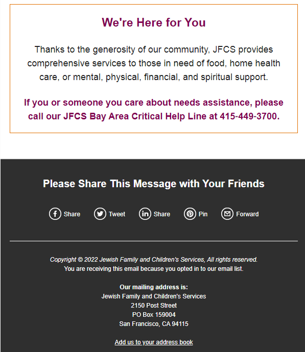
6. The conclusion reminding the donor of the organization’s broader helping mission is good branding.
DO: While it’s good practice to send appeals for specific projects, it’s always good to include readers in the overall mission. Some folks will give “where most needed” even when you send a specific appeal. And if you’re an organization offering something from which the reader or their loved ones can benefit, this may inspire them to give in order to assure your continued existence. It’s human nature to think “there but for the grace of…” When you offer to do unto them as they would want to be done unto, they’re likely to return the favor.
7. Making it easy for readers to share this message is a smart leveraging strategy.
DO: It’s easy to overlook the fact one inspired donor can inspire a bunch of other passionate actions. Whenever you make it easy for donors to share — either your message or the action they took to repair the world — you stand a chance of leveraging their action into a larger one. One $100 donor can become the equivalent of a $1,000 donor if they ask nine of their friends to join them.
DO: Sharing the mailing address is always a good idea. Some people don’t like to give online. This makes it easy for them to send a check, without having to look up your address.
Does The Donation Landing Page Inspire Action?
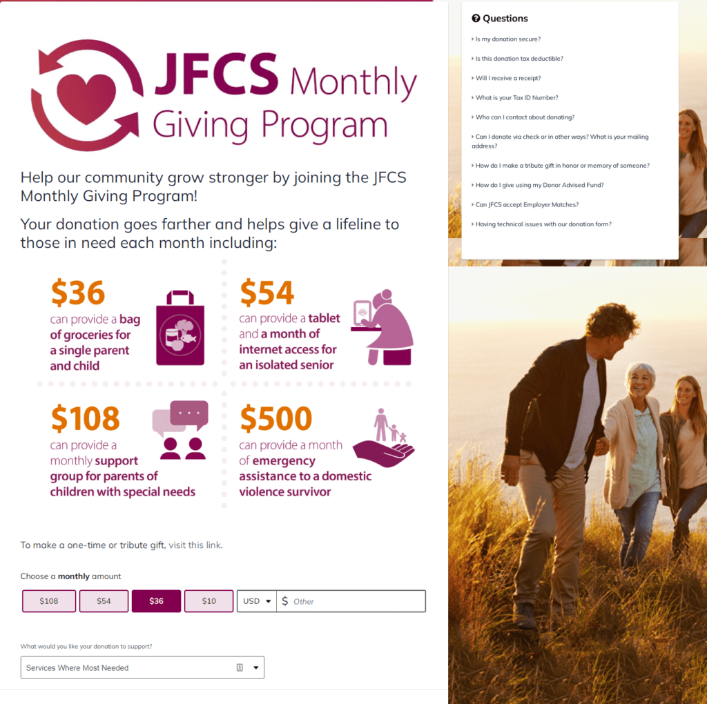
The first “DO” here is the fact the would-be donor is whisked to a dedicated landing page that matches the email design.
Too often folks are taken either to (1) a third-party site (e.g. PayPal or a purchased provider of landing pages) where they end up wondering “am I in the right place?” or (2) a generic landing page that doesn’t match the email copy and design. Anything that creates friction for the donor is to be avoided.
The second “DO” is the consumer-friendly FAQs section.
It’s expressly included to reduce friction by anticipating objections. I rewrite them below, since they’re challenging to read in the reproduction I’ve included in this post. [CAVEAT: To be honest, the font size on the website (just 9 points) could be pumped up a bit, but this is a minor quibble.]
I encourage you to read all the answers on their website as they are well written, reassuring and useful.
- Is my donation secure?
- Is this donation tax deductible?
- Will I receive a receipt?
- What is your Tax ID Number?
- Who can I contact about donating?
- Can I donate via check or in other ways? What is your mailing address?
- How do I make a tribute gift in honor or memory of someone?
- How do I give using my Donor Advised Fund?
- Can JFCS accept Employer Matches?
- Having technical issues with our donation form?
The third “DO” is the pre-selected default amount.
This can work well, but not always. You need to do some research to determine what average gift amounts are for your donors. And you may need different defaults for different donor segments. It can also be useful to add in an element of social proof, such as “people like you give an average of $50.”
Here are a few “DON’Ts”:
- When it comes to how to allocate the monthly amount, they may be offering too many different, unrelated choices. This makes selecting a donation amount difficult for the donor to scale.I’d love to see an A/B test to determine whether different amounts for different purposes vs. different amounts for the same purposes boosts or depresses response.
- When it comes to how much to give, the way dollar amounts are arrayed in the ask string is a bit of a dichotomy. The boxed options go from lowest to highest, while the gift range bar goes from highest to lowest. “Best practice” is unclear. I’ve seen data suggesting high to low performs best; also low to high, and even no ask string. Maybe here they were trying to hedge their bets. Again, this would be something it would be great to A/B test for your own nonprofit. Maybe even try A/B/C with the high-low; low-high and mixed approach used here? Once you get a winner, next you might try this against a “let the donor choose” no ask string approach. Needless to say, whatever you do it shouldn’t be an afterthought; there’s a real science behind ask strings.
The boxed options go from lowest to highest, while the gift range bar goes from highest to lowest. - The landing page photo looks like a stock photo. It also doesn’t tie to the photo in the appeal. It’s best if the images on the landing page reinforce the images in the appeal. The latter, in this case, looks authentic. The former does not.
Key Lessons Learned
- The email subject headline matters. A lot. It’s what gets your email opened or deleted. It doesn’t matter what’s inside if no one opens what you’ve sent. Here the copy was donor-centric – all about what I coud do! – plus it aroused my curiosity.
- The email copy must quickly resonate with the reader. Here I was reminded they know me and are grateful to me. They flattered me and made me feel good.
- The email copy must quickly get to the point. They told me what I needed to know. Enough so I could take action right now, or continue reading to learn more.
- Donor centricity is a must. If you don’t first get inside your donors’ heads (Ask: “What will our donors think of this? How will they experience it? What will it make them feel?”), you’ll likely not find the key to their hearts. If you make them like you, and show them how the values your organization enacts are the values they share, you’re more likely to get the action you desire.
- Images help. A lot! They are seen first, convey in an instant what copy takes longer to comprehend, and when paired with a good caption can make your entire case for support.
- Ask strings help donors know how much to give. Carefully consider the amounts and descriptions. Generally, don’t worry about coming up with a different purpose for different amounts. Use the same purpose, and multiply the amount or time period.
- Landing pages should conform to the appeal. Consider every element of your strategy, and strive to make them reinforce one another.
What do you think? Am I off base? Anything to add? Please share in the comments below.
Want More Help with Your Fundraising Appeals?
 You may find my Anatomy of a Fundraising Appeal Letter + Sample Template.useful. It’s a simple, incredibly thorough, 62-page step-by-step guide to crafting a killer appeal letter or email appeal. If you speak straight to the heart – and to your donor’s passions — you’ll raise more money.
All Clairification materials come with a 30-day, no-questions-asked, 100% refund guarantee. If you’re not happy, I’m not happy.
Please note: Often I can’t omit the name of the charity in the examples I use. Today’s example has many more “do’s” than “don’ts”, so hopefully I’ve not offended. Please know I always come from a place of love, and don’t mean to shame anyone. As with almost anything you can think of, there’s good AND bad in the examples I share. We learn both from mistakes and stellar efforts. Our own, and others. Kudos to all who put things out there and make an effort. The only way you learn is by trying. If I ever use you as an example, and you disagree or want to clarify, feel free to contact me directly.


Claire, once again, you’ve shared a thoughtful piece, and I love your suggestion to ask yourself questions before reading your insights. As you point out, there are a lot of good things happening here, enough that I was feeling warm and fuzzy. But I completely disconnected when the reply form photo didn’t relate to the story that I was engaged with. Also, I struggled that the amounts were for different items: what if I could give $50 but love the idea of giving a bag of groceries and hate computers: would I end up giving just $36? Having different items for each $ amount forced me to THINK instead of react emotionally, which for me = a lower amount or no gift. For the reply section area above the different amounts, I would make the focus on YOU (the donor) and Vivienne, not JFCS- something like You can give Vivienne and others like her consistent support… I wouldn’t say Vivienne is one of thousands because she is the one I’m emotionally connected too. Plus I know I can’t help thousands, so that feels overwhelming. Say: YOU can help someone like Vivienne, not: “JFCS will serve them”
I agree with you completely, and thanks for expressing this so clearly. I was trying to say the same thing, but you may have out-written me!