 What if I told you there’s a teensy little digital upsell that could skyrocket your year-end fundraising results? Would that be of interest?
Darn rootin’-tootin’!
Okay. Here’s something you still have time to do. It has to do with your website, so consider looping in whoever is responsible for that part of your year-end marketing and fundraising strategy.
First, let’s look at a typical Donation Landing Page with a call to action via some compelling text, maybe a photo, and a big, bold “Donate” button. Hopefully you’ve optimized it for mobile too. And, no matter what device your donor uses to access the page, they’re able to complete their gift with no more than two clicks.
Check, check, check, check and check.
You’re well on the way (or not quite) to getting some nice traction for your campaign.
But… don’t stop there!
Because you can significantly boost your results if you add one simple thing.
I like to think of it as “the force.”
It’s not a light saber, but it’s similarly luminous.
It’s called a…
Light Box
Alternatively, it’s called a splash page (because when someone visits your website it ‘splashes’ up onto their screen with an important message). It’s a form-based box that literally “lights up” the screen to shine a light on whatever message is your SMIT (single most important thing) at that point in time (some folks also call this a shadow box, pop-up, or high-jacking).
Wait… you say you don’t like ‘pop-ups?’ It’s not about what you like. It’s about what works. And they do work. Per Sumo, an average pop-up, converts visitors to buyers at 3.09%, and the best around 9.28%. With 100 site visitors a day, that’s an extra 92-274 conversions per month. Nothing to sniff at.
At the end of the calendar year, usually your message will be a donation call-to-action. It usually pops up the first time folks come to you for the period for which you set it up – perhaps once/day during the four to six weeks you’re running your year-end campaign. [The best advice I’ve heard is if your visitor dismisses the popup, don’t show it to her again for at least a week].
Again, you or your leaders might find them annoying. But they work. And they work especially well for targeted campaigns like the end of the calendar year. Your conversion rate from prospect to donor goes up with a light box because more people will see your call-to-action. They can’t help but notice it, because you’ve put it right in their faces. I first used one when working at a food bank, and it increased online donations during that period by almost 30%. It may/may not work for you, but it’s worth testing.
Note: You’ll probably want to disable popups on mobile devices. Not all mobile devices can handle popups… and not all popups can handle mobile devices.
For year-end fundraising, a light box can remind folks:
-
The deadline for calendar year donations is fast approaching.
-
The deadline to double your impact through our challenge grant is fast approaching.
-
Now is your opportunity to create your own fundraising page to help us raise holiday gifts.
-
Your gift works all year round when you join the Monthly Giving Club today.
-
Make your Giving Tuesday commitment here.
And so forth.
But before your donor gets to the Light Box – or anywhere else on your website – they have to have begun their journey towards you somewhere else.
The Donor Journey toward Your Year-End Donation Page
Either the donor was looking for you, or you were looking for them.
In the former case, they may have been searching to help with a cause like yours. They typed into their browser “local veteran’s relief,” “national cancer research,” “undocumented immigrant rights,” or “guide dogs in Mariposa County.” Your organization came up [because you’ve done a great job with search engine optimization (SEO)], and they were taken to your home page. Or maybe to a particular program page. Or even to your donation page.
In the latter case, you promoted your services or campaign via email or social media, or they saw an ad you placed on Google, and they clicked on a link that took them to your website.
However your prospective donor gets to you, ideally you take them to the page most likely to help them find what they’re looking for. If they’re considering philanthropy (and that happens more frequently at the end of the calendar year than just about any other time), you want to get them to your donation landing page as quickly as possible.
Here’s where a Light Box can create some donor-friendly efficiency.
Because when they arrive on your website, wherever they arrive, the Light Box pops up and lets them know if they’re there to donate they can do so quickly and simply by clicking on the link in the Light Box. If they’re interested in services, or something else, they can simply close the box and continue on their journey.
Have You Ever Had Trouble Trying to Make a Donation?
I certainly have!
Sometimes the “donate” button is hard to find.
Sometimes once you get to the Donation Landing Page, you find it directs you to a multitude of different pages – and it’s often unclear which one you should click on. For example, you may be given options such as:
- Ways to Give
- Annual Campaign
- Legacy Giving
- Monthly Giving
- Special Events
- Start Your Fund
- Memorial Giving
- Matching Gifts
You click on several, trying to find the form you seek. The one that lets you enter in a dollar amount and credit card. It should be so simple. But…
By the time you finally find the page you’re looking for, you’ve had to click three or four times. You get annoyed. Sometimes, you give up.
What if a Clear Sign Directed You to the Right Place Immediately?
That’s what a Light Box does!
The donor doesn’t have to wander all around looking for the right place.
The Light Box takes them right away to your Donation Landing Page.
And you control when, where and how often the Light Box appears.
Want to See Some Light Box Examples?
Here are two from the San Francisco Food Bank. When I served as their Director of Development, we used one from Thanksgiving through end of year for calendar year-end giving. It worked well, so after I left they added one pre-Thanksgiving. You can see how it ‘splashes’ over the regular home page.

Here is another they used to inspire end-of-fiscal-year giving:

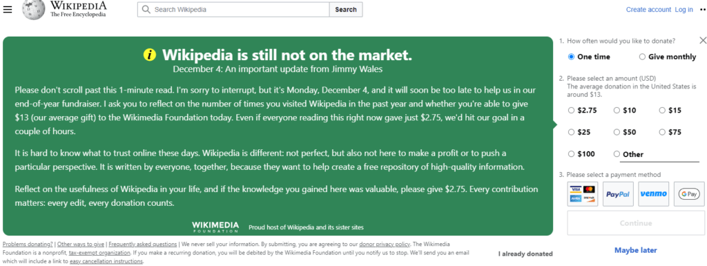
Here is one from Wikimedia, and I confess it gets me every time. It pops up immediately during the last month or so of the calendar year, whenever a user clicks on a Wikipedia article, simply reminding them how much they may rely on Wikipedia over the year and how Wikimedia is funded.
There’s More Than One Way to Use a Light Box
You can use them immediately following the point of donation.
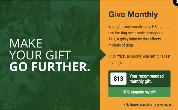
This is a great tweak if you want to inspire donors to make a recurring donation – something that usually works to upgrade your donor’s overall giving commitment. What’s also great about this is the fact that monthly donors are retained at a rate of 80-90% compared with an average of 46% for one-time donors.
These so-called ‘upsell’ lightboxes pop up when your donor has completed your online donation form.
This one is from the Humane Society.
Speaking of using lightboxes to promote recurring giving…
The amazing folks at NextAfter ran an experiment on a donation page using a pop-up to prompt one-time donors about to submit their gift to upgrade to a recurring gift. It increased recurring giving by 64%! They didn’t stop there. After it worked once, they rolled it out to every donation page on the organization’s website. The result? An overall increase in recurring giving of 24%. That’s not chicken feed! Not only that, they found it didn’t keep any one-time donors from giving. It just increased the percentage of donors giving monthly
You can use them to put the idea of donating into someone’s mind when they click on a link to read more about a story they saw in your e-newsletter.
Here’s one from the ACLU several years back. I happened to be reading a story and wanted to learn more. I clicked and was taken to a page with a story titled “More Than 500 Children Are Still Separated. Here’s What Comes Next,” I was quickly greeted with the following pop-up lightbox:

Making Light Boxes Work for You
The technology isn’t as tricky as you might think.
- If you have a savvy tekkie on staff, there are tutorials on how to code Light Boxes on YouTube. Simply use your browser to search on “light box,” “splash page,” or “pop-up,” and you’ll find plenty of resources.
- There are free plugins available, as well as other affordable options you can pay for to create and launch your Light Box. Of course, if you pay you’ll get more options. Check out the free SumoMe WordPress plugin and the affordable OptinMonster. Find more top options here and here. Also talk with your CRM provider to see what they offer, whether they integrate with Google Analytics (so you can easily track conversions) and whether there’s an easy way to set up A/B testing.
You’ll win as long as you put your donors first.
There are ways to minimize annoyance. Begin by making sure the content of your Light Box is relevant to what the donor was searching for. If they came to your website looking to be helpful in furthering your mission, or even just hoping to learn something about your mission, they should respond well to a message that instantly shines a light on the value of your work. In fact, a well-executed Light Box can even give the would-be donor an anticipatory warm glow.
The example above, from the Food Bank, achieves this because they make the donor envision themselves as a hero.[In this case it’s a “hunger-fighting hero,’ but it could just as easily be a “Bay-saving” hero (as in the example below) or whatever type of hero works for your cause.]
Chesapeake Bay Foundation simplifies things with just three elements: (1) a beautiful image; (2) a single simple call to action, and (3) a particularly high-value result as the donor can double their impact.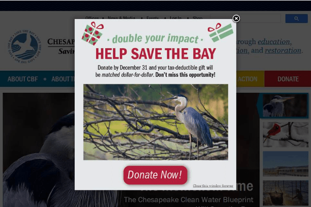
-
Consider how often you want folks to encounter your Light Box. As noted above, you can control when and how often the Light Box appears. For example, you might decide on once/day per visitor.
-
One more thing: See the little “X” up in the right-hand corner? Make sure you include this, or a “Close Window” option so folks who want to skip the pop-up message can do so easily.
Light Boxes: A Force to be Reckoned with
Carefully crafted, Light Boxes can create more pleasure than displeasure.
Whatever you do, track your results. Don’t be swayed by isolated complaints. It’s overall performance that matters. If your bounce rate spikes, you can always tweak things and perhaps slow down the number of times the Light Box pops up. Or you can try a different message, design and/or call to action. Light Boxes are a great opportunity for A/B testing.
Ultimately, as they say, the proof is in the pudding. If you find you’re receiving more gifts, this is something you’ll want to continue.
Let the Force of a Lightbox Be With You
Want More Year-End Fundraising Strategies?

Your all-in-one guide for ticking off things you may be missing or not quite have finished
If you’ve got your year-end fundraising plan completely under control, yay you! If you need to spend a bit of time making a list of ‘to-do’s, now’s a good time. Grab my Year-End Fundraising Solution Kit – To-Do’s and Checklists. It’s a 63-page-long, step-by-step comprehensive road map to effective year-end fundraising. After working 30+ years in the trenches, I can vouch for this stuff. It’s tried and true! Not satisfied? All Clairification products come with a 30-day, no-questions-asked, 100% money-back guarantee. You truly can’t lose!
And if you can’t do everything you wish you could this year, get ahead of the game and put it on your list for next year.
Photo by Tobias Cornille on Unsplash


