
Fundraising Do’s vs. Don’ts: Year-End Email Appeal Strategy Review
Here comes my occasional “Do’s vs. Don’ts” feature, where I share with you something arriving in my mailbox that seems a good ‘teaching opportunity.’
Today we’re going to review an online renewal appeal strategy.
It arrived as an email. There’s (1) a subject line, (2) a preview pane, (3) the email itself, and (4) what happens if/when you click through and are transported to the donation landing page.
We’ll take a look at the various elements; then assess what works/doesn’t work.
I’ll ask you some questions.
- Would you open this email?
- If yes, why?
- If no, why?
- What looks good about the email?
- What looks not so good about the email?
- Would it inspire you to click through?
- If yes, why?
- If no, why not?
- Once you click through, would you be inspired to take action?
- If yes, why?
- If no, why not?
First, I’d like you to think about your answers and jot them down.
Second, I’ll tell you what I think.
Third, if you disagree with me please let me know in the comments below.
Really take the time to notice what you like and don’t like.
I promise you’ll learn a LOT more this way. We learn best by doing.
Seriously, I mean it.
Let’s begin at the beginning.
The Renewal Appeal
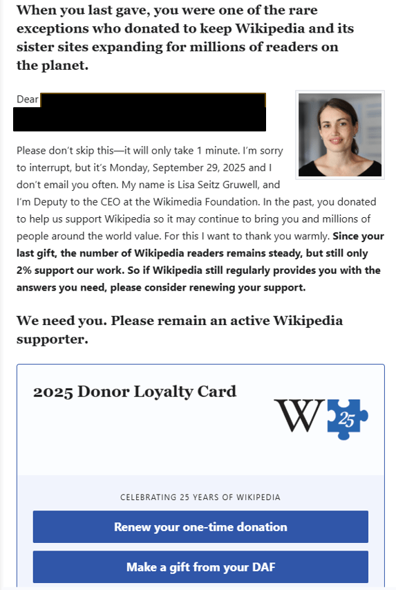
Here’s an email sent by the Wikipedia Foundation September 29th – on the cusp of the most generous quarter of the year for fundraising. The timing is great, because it’s landing in people’s inboxes before they’re hassled with year-end stressors. Plus, even if the recipient doesn’t give right away, it sets the stage for additional appeals. Remember, it’s good to send multiple emails because they have a short shelf life compared with a mailed appeal. It may take folks seeing more than one message from you before they actually notice it. So, plan ahead to be a little bit repetitive.
Subject Headline:
You are one of Wikipedia’s rarest supporters.
Preview pane:
I owe you an update.
What are you thinking and feeling so far?
This may help: Take three minutes and jot down your answers to the first three questions above on a piece of paper or your screen. I want to know if what was in the subject headline would have caused you to open the email or hit ‘delete.’
Okay. Ready to learn what I think thus far, and also see what else we’re working with?
Let’s begin!
Does this Email Say “Open Me?”
What’s wrong or right with this subject line and preview pane?
Your email subject line and preview pane are the online equivalent of the direct mail envelope. You need to begin a conversation and/or arouse curiosity.
This subject line did the latter well.
- It aroused curiosity… the recipient wonders what might be so rare about them?
- It also used flattery… who doesn’t want to feel rare?
- It also used the personal “you” in lieu of institution-centered words like “we,” “our,” “us,” and “organization’s name.”
The preview pane also worked, as it made me feel I was owed something. So, I better not miss my opportunity to collect! Generally, though, I’d avoid the word “update.” People don’t really long to be updated. They’d prefer it if you just messaged them when you had important “news” to share.
I would still open it.
TIP: Read this article: You Deserve to Rock Nonprofit Email Subject Lines!
Does This Email Message Inspire Action?
Body copy (partial):
What looks good about it?
Again, I beseech thee to take a few minutes to think this through yourself before you look at my thoughts.
What do you especially notice?
What do you like? Not like?
Don’t cheat and scroll down to what I have to say.
You may disagree, and I’d love to know your thoughts. Your thoughts matter!
Okay?
Ready?
It’s mostly good. So, let’s begin there.
Here’s what I like:
- Please don’t skip this—it will only take 1 minute. I immediately know this won’t take much time, inclining me to keep reading.
- I don’t email you often. I’m reminded they don’t ask a lot, which makes me feel kindly towards them.
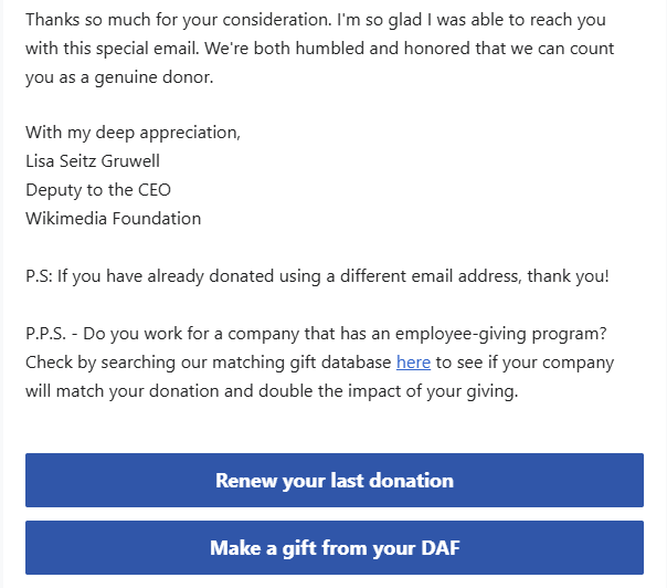
- My name is Lisa Seitz Gruwell, and I’m Deputy to the CEO at the Wikimedia Foundation. There’s a real person’s name, and an attached photo so I can put a face to it. This is good, because people give to people. Not organizations.
- For this I want to thank you warmly. Gratitude works. In fact, research by William Damon, Robert Emmons, and others has found people who are able to count their blessings are much more likely to try to “contribute to the world beyond themselves.” It’s always good to lead with a thank you.
- So, if Wikipedia still regularly provides you with the answers you need, please consider renewing your support. This is the case for support in a nutshell. It reminds the reader the results they google just about daily are there only because Wikipedia puts them there. It’s a pretty personal, immediately connecting message.
- The 2025 Donor Loyalty Card is a nice touch. People want to belong, so this membership card (even though not tangible) makes them feel part of something larger than themselves.
- If all our past donors gave again today, our fundraiser would be over. This creates some urgency, and puts the donor’s gift in the context of a larger community.
- Wikipedia is different in that it doesn’t belong to the highest bidder, advertisers, or corporations. It belongs to you, the readers, editors, and donors. You’re our community, our family. You’re the reason we exist… Here’s the expanded case for support, reminding the donor that they are the beneficiary of the foundation. The value-for-value exchange is real. Give and you get. That’s powerful.
- Do you work for a company that has an employee-giving program? Check by searching our matching gift database here to see if your company will match your donation and double the impact of your giving. SO many matching corporate gifts go unclaimed every year – which makes me really sad. If you want these gifts, you have to be proactive. And, ideally, this means making it really easy for donors to find out if their company will match their gift. Wikimedia does this with software from Affinaquest’s HEPdata, recently purchased by Double the Donation.
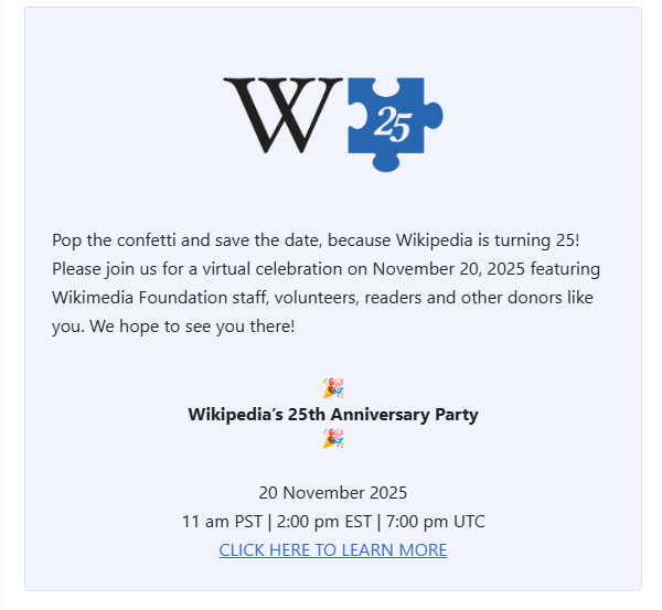
- Please join us for a virtual celebration on November 20, 2025 featuring Wikimedia Foundation staff, volunteers, readers and other donors like you. This is nice because it’s an opportunity to interact with a community of like-minded folks – further building a sense of belonging. And, it’s a bit of a gift to supporters. If you want gifts, you must give them.
Here’s what I don’t like:
If we’re being honest, the body of the message isn’t really an “update” at all. It’s not even news. It’s an ask. Pure and simple.
TIP: This may seem nitpicky. But, don’t pull a bait and switch. If you’re going to set yourself up to fulfill a promise (by telling me you owe me something), you better fulfill it! If you don’t, trust erodes. And trust is the foundation of all lasting relationships.
Does the Donation Landing Page Inspire Action?
The donor is given two buttons with which to make their gift. With either button, the would-be donor is whisked to a dedicated landing page that matches the email design.
This is the first “DO” here.
Too often, folks are taken either to (1) a third-party site (e.g. PayPal or a purchased provider of landing pages) where they end up wondering “am I in the right place?” or (2) a generic landing page that doesn’t match the email copy and design. Anything that creates friction for the donor is to be avoided.
Okay, let’s look at the two landing pages.
One is for an ordinary cash/credit renewal.
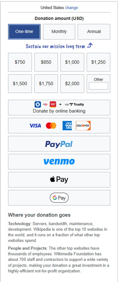
Here’s what I like:
- All the different payment options offered. This makes it easy for the donor to renew using their preferred method. Far too many nonprofits still only facilitate credit card transfers. That’s insufficient in today’s rapidly evolving digital marketplace.
- They inform you, specifically, where your donation goes. And how the size and scope of this organization compares with other top websites. Again, this establishes trust.
What I don’t like:
- If you click on the “monthly” option, the numbers in the gift array don’t change. To realistically mirror the annual choice, the monthly option should begin with something that would be similar when multiplied by 12 (e.g. 65). The only realistic option a donor has here is to fill in the “other” amount box. But this requires them to do math – which could stop some donors in their tracks, causing them to “abandon cart.”
ACTION TIP: I would consider pre-selecting “Monthly” rather than “Annual.” This is a great way to increase donor retention. Plus, it’s an excellent way to upgrade giving. This would be a great opportunity for a do a randomized A/B test.
- If you click on the “annual” option, it doesn’t look any different than the one-time or monthly option. The difference between one-time and annual isn’t explained, and it’s unclear what you’re actually committing to.
ACTION TIP: I would probably eliminate this option. Too many choices can lead to analysis paralysis. Also, do you really want to lock in an annual rate? If you do, upgrading this gift amount becomes problematic.
The other is for a renewal through a donor advised fund (DAF).
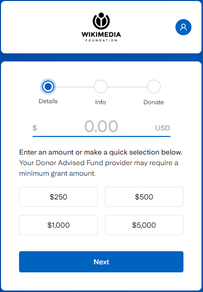
I love that they make it easy for folks to give through a DAF. Not enough charities do this! With DAF giving on the rise, this is more important than ever. If you make it difficult (i.e., multi-step) to give, would-be donors will put your appeal aside for later. Alas, too often “later” never comes. And money is left on the table.
Key Lessons Learned
- The email subject line and preview pane matters. A lot. It’s what gets your email opened or deleted. It doesn’t matter what’s inside if no one opens what you’ve sent. Here the copy aroused my curiosity and promised me something in return for my opening the email.
- The email copy must quickly resonate with the reader. Here I was reminded they are grateful to me. They flattered me and made me feel good.
- The email copy must quickly get to the point. They told me it would only take a minute of my time, and gave me the case for support in a nutshell. It was what I needed to know. Enough so I could take action right now, or continue reading to learn more.
- Donor centricity is a must. If you don’t first get inside your donors’ heads (Ask: “What will our donors think of this? How will they experience it? What will it make them feel?”), you’ll likely not find the key to their hearts. If you make them like you, and show them how the values your organization enacts are the values they share, you’re more likely to get the action you desire.
- Images help. They are seen first, and we like to put a name to a face. Another organization might include images reinforcing the mission. In this particular case it would be difficult.
- Ask strings help donors know how much to give. Carefully consider the amounts and descriptions. These were a bit confusing as they didn’t seem connected to anything specific.
- Landing pages should conform to the appeal. Consider every element of your strategy, and strive to make them reinforce one another.
- Make it easy for the donor to give. Any friction will cause the recipient to leave the page. Offering multiple ways to pay, including from a DAF, is imperative in today’s landscape.
What do you think? Am I off base? Anything to add? Please share in the comments below.
Want More Help with Your Fundraising Appeals?
 You may find my Anatomy of a Fundraising Appeal Letter + Sample Template.useful. It’s a simple, incredibly thorough, 62-page step-by-step guide to crafting a killer appeal letter or email appeal. If you speak straight to the heart – and to your donor’s passions — you’ll raise more money.
All Clairification materials come with a 30-day, no-questions-asked, 100% refund guarantee. If you’re not happy, I’m not happy.
Please note: Often I can’t omit the name of the charity in the examples I use. Today’s example has many more “do’s” than “don’ts”, so hopefully I’ve not offended. Please know I always come from a place of love, and don’t mean to shame anyone. As with almost anything you can think of, there’s good AND bad in the examples I share. We learn both from mistakes and stellar efforts. Our own, and others. Kudos to all who put things out there and make an effort. The only way you learn is by trying. If I ever use you as an example, and you disagree or want to clarify, feel free to contact me directly.


Excellent post, Claire! I’m glad you chose Wikipedia as your “example,” and I’m making my comment not only to commend your post, but also to encourage all your subscribers to consider supporting Wikipedia.
I’ve found it to be a phenomenal resource, so I’ve chosen to be among the (disappointingly low) 2% of Wikipedia users who actually help fund its work — which, to my understanding, is free to anyone anywhere.
May I suggest you please send this post on to Lisa Seitz Gruwell, as I’m quite sure she’ll appreciate your having used Wikipedia as your example, and she’ll find a lot of value in your “review” of her email on behalf of Wikipedia.
Craig Cline/on behalf of the GoldenRuleism Team