
How to Stay Relevant—Even If You’re Not Saving Lives
What emotions align with your nonprofit’s mission and brand identity?
I adore color. I’m definitely not someone who wears only black! I thought it would be interesting to think about how we use color in our donor communications, and happened on several great infographics, including The Psychology of Color in Design and Color Psychology and Marketing. They offer a terrific overview of the meaning of colors in the western hemisphere. What you’ll learn is eye opening.
Color is a powerful form of nonverbal communication. There should be more to selecting color than just a whim. Color influences behavior. Color evokes emotions. Have you ever seen a movie with and without the underlying musical score? Like music, color can make a huge difference in how our message is perceived. Color can make us feel relaxed, productive, peaceful, creative and even angry. Color can alert us to an emergency situation or to a successful, growing organization. Color can make us feel generous and open or stingy and closed. What do you want folks to think/feel/do when they see your (1) website; (2) annual report; (3) appeal letter; (4) event invitation and décor; (5) blog design?
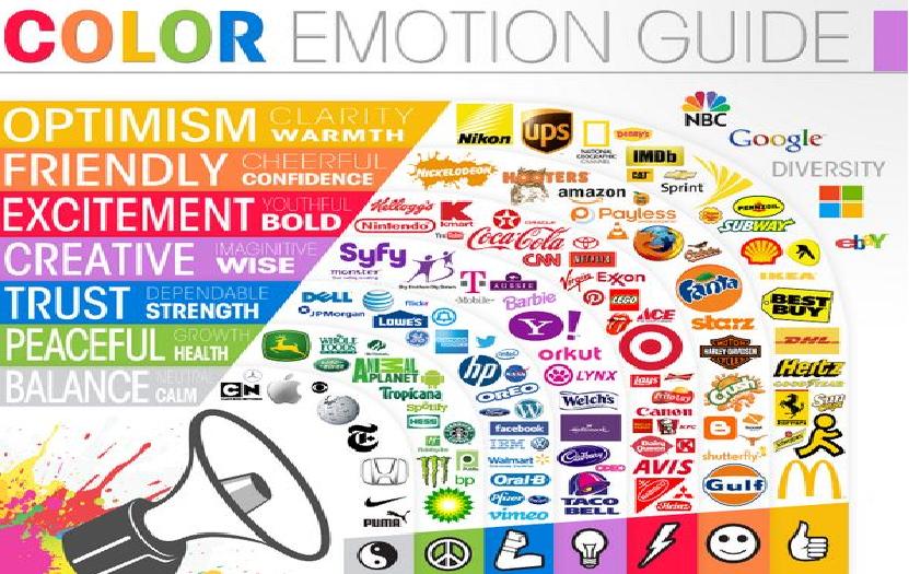
 Let’s start with a few simple ideas about color. Bluefor example says cool (if too dark, it says cold), calm and fresh. It’s associated with water, peace, loyalty and trust. Men prefer blue above all other colors, which may explain why it’s perceived as businesslike. When used in a dwelling it enables the greatest productivity. Redexcites us. It can mean stop, emergency or danger; it can also mean festivity (e.g. Christmas, Valentine’s Day). And, of course, we associate red with love and passion. Yellow makes us feel sunny, happy and energetic. It’s the color of optimism and can grab attention and inspire creativity. Yet it is straining on the eyes, and it makes babies cry. Orangeis also associated with energy, warmth, excitement and ambition. Yet it can also mean caution, slow down. It is not a calming color. Green evokes freshness, health, growth and nature. Light green traditionally was used in hospitals to evoke tranquility. It’s also the color of money. And, depending on context, it may be associated with envy and luck. Purplecan make us feel relaxed and creative. It’s also associated with royalty, wisdom and wealth. It adds a touch of mystery and exoticism, and is also the favored color of adolescent girls. Pink can evoke calmness, romance and femininity. It is the gentlest of all the colors. Brown signifies the earth, practicality and reliability. ‘Terra firma’ is stable. Yet it can also say boring. Grey is practical and solid. It’s a middle of the road hue. If you shoot some silver into it then it becomes of solid, “sterling” character. Blackis associated with death, mourning and evil. It’s also austere; the opposite of warm. At the same time, it’s authoritative and elegant. The absence of color – “white space” – is associated with purity, innocence, cleanliness and breath.
How we use colors together also has emotional impact. Use of a single color in varying shades can be soothing. Using all the primary colors together feels childlike. Using all the secondary colors feels contemporary, modern and playful. Some colors used together make people feel patriotic. Others evoke holidays. And colors also come and go in trends. One thing to guard against with trends is ignoring underlying psychological triggers. Say orange is the hot new color for clothing and accessories? Does that mean it’s the best choice for our annual appeal if we’re trying to evoke growth and renewal of purpose?
Take a look at some of the most well-known nonprofit brands you’ll see a lot of thought goes into their color choices. Sierra Club uses a lot of green. Charity: water uses a lot of blue. Susan G. Komen is all pink. Sometimes you can get around unfortunate legacies by selecting photos with colors that evoke the message you’re trying to impart. Or you can add secondary colors to your communications. Or you can create special pieces for special purposes, including your logo in black and white. Or perhaps just a splash of color to draw attention where it’s needed most.
Don’t forget to think about your target market. You may serve children, but the folks reading your messaging may be parents or grandparents. Kids like primary colors. Grandparents may require a dose of trust. So you might have splashes of red and yellow with a predominance of blue. As long as you’re thoughtful about what you’re doing you’ll be ahead of the game.
Speaking of getting ahead of the game… registration for The Power of Appealing Year-End Appeals ends midnight Saturday, October 19th. Yup, it turns into a pumpkin. There’s a lot more than color and design needed to make your solicitation package a killer! Put your best foot forward this year… give yourself the advantage of some great tips, tricks and treats. Happy early Halloween! Register right here!

This article was originally published on Clairification in 2012


Claire, as I was browsing your website, I was looking at the “Power of Appealing Year-End Appeals” and when I clicked again, was told “Your paypal payment was successful. I did NOT sign up for this. Please be sure that I have not been charged in error for this. Thanks.
No charge was applied. And thanks for letting me know about this weird glitch.
Texto bem organizado e completo, sou apaixonado pelo significado e simbologia das cores. Obrigado pelo conteúdo de qualidade, muito bom mesmo.
Well organized and full text, I am passionate about the meaning and symbolism of colors. Thanks for quality content, very good!