 Remember the children’s ditty The Farmer in the Dell?
At the end, when all is said and done, what happens to the cheese?
It STANDS ALONE.
Your fundraising appeal response device, whether a reply card or donation landing page, is very much like this proverbial cheese.
In fact, it may be the most important element of your fundraising package.
Do you treat it with respect?
Or do you focus the lion’s share of your time on crafting, reworking and editing your appeal copy? Then thinking about your letter and package design? And then waiting until the very last minute to think about your response device, treating it like a nuisance or unimportant chore?
Way too often I see folks spend endless hours crafting their appeal, only to fly by the seat of their pants when it comes to the response devise. This is a huge mistake.
YOUR RESPONSE DEVICE MUST STAND ALONE
Fill your response device with virtual rainbows and unicorns.
 The cheese is the centerpiece of The Farmer in the Dell — all that’s left after everyone else has exited.
Being the centerpiece should be a good thing, right? But… not if it’s treated with disrespect.
Remember how in school, when you played the Farmer in the Dell game, no one wanted to be that cheese at the end?
- It’s your job to make sure this particular piece of cheese doesn’t end up sad and forlorn like the one in the children’s game.
- It’s your job to make this piece of cheese tough and self-sufficient.
- It’s your job to treat this piece of cheese with the respect it deserves!
Because your reply card is also all that’s left after the rest of your appeal has been dismissed.
Often folks will throw your letter away; then save the reply card or envelope to make a decision when they pay their bills or sit down with their family to consider all their charitable giving for the year.
For this reason, I actually recommend you begin with your response device.
Your reply card and/or remit envelope must make the case standing alone!
USE A REPLY CARD/REMIT ENVELOPE THAT SELLS
Think of your reply device as a stand-alone, mini-appeal.
With the letter long forgotten, unless you make a compelling case for support in the little piece of your appeal package that’s left, you’re going to risk losing the gift.
At this point, it doesn’t matter how persuasive you were in the letter. The only thing the donor will now consider is what you’ve included on your response piece. So…
- Include a compelling photo that tells a story; use a caption if this helps to make an emotional connection.
- Put a heading on the reply card such as “Yes! I want to feed hungry children!”
- Include a big check-off box next to your heading; interactivity gets folks more engaged and invested.
- Include a succinct one-sentence summary of your case using active verbs, such as “Timmy and thousands of kids like him will go to bed with full tummies tonight, because you care”.
- Show the specific impact of gifts at different levels; use check-off boxes again here:

Give your donor clear, specific choices
Don’t make your donor guess how much you’d appreciate as a gift. If you give them some options they’ll be more likely to give.
In fact, a variable ask string based on the prospective donor’s giving history or capacity is proven to help match or upgrade their last gift. In the string, it’s wise to set one of the choices as the “anchor“ amount (e.g., by listing it first or pre-checking a default box.). There’s also research that simply offering gift options from high to low rather than low to high will lift gift averages. [If you want to delve into the nitty gritty of setting default options, read this abstract.]
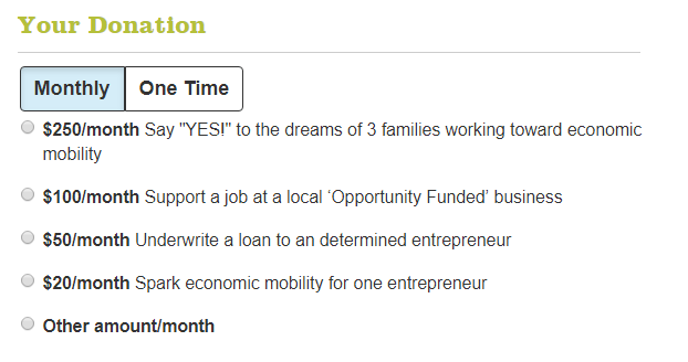
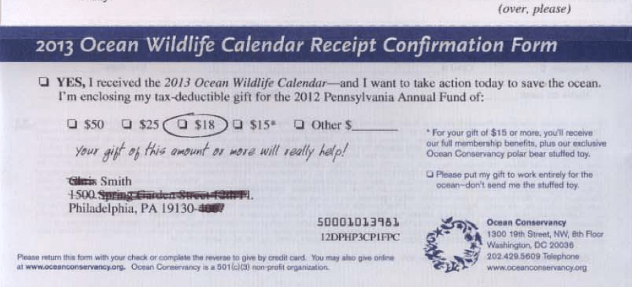 This generally means it’s a good idea to have more than one version of your reply card tailored to prospects/donors at different giving levels.
Be donor-centric so it’s friendly and easy for the donor to complete.
- Pre-print the donor’s contact information (e.g., name, mailing address, email and phone) on the reply form). Leave space for corrections, and to fill in info you don’t yet have.
- Limit the amount of information you request from your donor; if it’s too much work, or starts to seem nosy, they’ll put it aside.
- Use paper stock that’s easy to write on.
- Use 14-point font so everything is readable.
- If there’s an adhesive seal, make sure no important donor information gets lost when the envelope is opened in your mail room.
- Include a list of opportunities to designate gifts for particular programs if you want to engage donor passions and increase your average gift.
- Include a check off for the donor to indicate they’d like this gift to be in memory/in honor of a loved one; leave space to write the loved one’s name.
- Offer a monthly giving option if you want to boost your renewal rates.
- Tell the donor how the check should be made out.
- Include a postage paid business reply envelope (if you want, you can test this against reply envelopes without postage and see which gets a higher response rate; in my experience postage paid gets better results).
- Address the return envelope to a specific person or specific campaign.
USE A REPLY CARD/REMIT ENVELOPE THAT ENGAGES
Branding and contact info are a must.
Remember, this must stand alone.
- Make sure it includes your name and logo so folks remember who the appeal is for. You’d be surprised how easy it is for this to get overlooked, especially when you contract with outside designers who think more about colors, fonts and lay-out than practical things donors need to know!
- Also include your address (in case the envelope gets separated from the card).
- Give contact information — the name, email and phone number of someone the donor can easily reach if they’d like to make a credit card gift or ask a question.
- Include your website donation page URL so folks who wish to can easily give online.
Include some interactive elements.
You may also wish to consider including a few elements that actively engage your donor. The Publisher’s Clearinghouse folks know a thing or two about getting folks involved, and that’s why they include all sorts of stickers for folks to affix in different places.
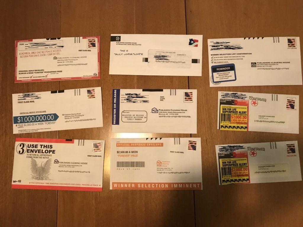 You don’t have to get this fancy, but consider a few of the following:
- Include a box with room for handwriting that asks a single, succinct research question, such as “What one word would you use to describe [your organization’s name]?”
- Include a check-off where folks can indicate if they’ve made an estate plan provision for your organization.
- Include a check-off where folks can indicate they’d like more information about something (e.g., volunteer opportunities; events; legacy giving; monthly giving club).
Do you have other tips to make your response device as compelling as possible? Please share!
Make Sure Your Appeal Letter Shines Too!
 Get my Anatomy of a Fundraising Appeal Letter + Sample Template and assure you’re speaking straight to your donor’s heart and passions. Whether you’re a pro wanting new tips, or writing an appeal for the first time, take your appeal from anesthetizing to… astounding. From colorless to… captivating.
Rock these tried-and-true tactics to get your appeal to the next level.It’s got everything you need to knock your appeal out of the ballpark – and then some!
Like all Clairification products, it comes with a 30-day, no-questions-asked 100% money-back guarantee.


My question is, just how physically long should a response piece be? All the info you suggest here seems to me will require almost a one-page response card (front and back). 🙂 The third of a sheet makes it easy to slip into a reply envelope. Do you have an example of a of a reply card that you love and think we should emulate? Thanks!
Great question! It can be a daunting task, indeed. To get more space, I like to use a reply envelope so you essentially have the entire inside of the envelope on which to print (top flap and bottom). You can even add photos on the reverse side. These folks have some good suggestions. https://fivemaples.com/blog/tutorial-design-reply-card-raise-money/ The one they show in their article could be improved (IMHO) by substituting a photo for the amount of previous years’ gifts (I prefer to mention that, if at all, in the letter. As in “Last year your generous gift of $500 meant so much! Would you consider a gift of $750 this year so we can….” There is also a link from this page to some samples from other organizations.