 It’s not too late to use these tips to help with your year-end fundraising.
This new “Do’s vs. Don’ts” feature is popular, so I thought I’d share another one that seems like a good ‘teaching opportunity.’ It’s a twofer, as I’ll discuss both the appeal and the donation landing page to which it takes folks — should they be inspired to click through.
Please note: Sometimes I can’t omit the name of the charity in the examples I use. Please know I’m coming from a place of love, and don’t mean to shame anyone. As with almost anything you can think of, there’s good AND bad in the examples I share. We learn both from mistakes and stellar efforts. Our own, and others. Kudos to all who put things out there and make an effort. The only way you learn is by trying. Believe me, I’ve sent out some real clunkers in my time as a development director! If I ever use you as an example, and you disagree or want to clarify, feel free to contact me directly.
Okay. Let’s move on.
We’re going to evaluate every element methodically.
I’ll ask you some questions.
- Would you open that email?
- If yes, why?
- If no, why?
- What looks good about it?
- What looks not so good?
- Would it inspire you to give?
- If so, why?
- If not, why not?
First, I’d like you to think about your answers and jot them down.
Second, I’ll tell you what I think.
Let’s begin!
Do you think this email is a “Do” or a “Don’t?”
Subject headline + Preview pane

Body of appeal

I’ll tell you my own thoughts in a moment. But first…
Think it through yourself because you’ll likely get more out of this if you do.
Seriously, I mean it. We learn best by doing.
This may help: Take three minutes and jot down your answers to the first three questions on a piece of paper or your screen. I want to know if what was in the text, caption or photo would have caused you to open the email or simply scroll on by.
-
Would you open that email?
-
If yes, why?
-
If no, why?
Okay. Thinking?
Jotting?
Good! Good!
Ready to know my answers?
Subject headline + Preview pane
1. Would you open that email?
Probably not. Donors don’t really give because it’s a specific date. They may do so if they already know you and would give to you regardless of when you sent the appeal. But, either way, the fact it’s Giving Tuesday won’t inspire people to make a passionate gift. They’ll give what they usually give, if you’re lucky. Or maybe…. Less.
Since this is a Giving Tuesday email, I want to point out this email won’t necessarily raise a lot of “plus” gifts in addition to your existing donors’ end-of-calendar year gifts. I find many of the nonprofits I work with discover #GT merely changes the date on which their supporters give. For this reason, I advocate making #GT “Gratitude Tuesday” — a day on which you give back to your donors. It doesn’t have to be something tangible. Just a lovely thank you will suffice. There are lots of great “gift” ideas for donors in my Creative Ways to Thank Your Donors e-guide.
2. If yes, why?
Because I’m already a donor and would give no matter the date.
3. If no, why?
Because the preview pane gets me off the hook right off the bat with “No amount is too small.” This tells donors one of two things:
- You don’t really need a large gift from them (i.e., you’re just asking for money because it’s Giving Tuesday, and everyone else is asking, so…. you may as well ask too). Hardly inspiring.
- Whatever they give will be a token. Doesn’t make them feel good.
Generally, telling folks variations of “gifts of any amount help” or “every little bit helps” cause donors to think their gift will be a drop in the bucket. This doesn’t make donors feel particularly motivated or joyful about their philanthropy. You want donors to feel uplifted by their giving! Stop begging folks to just “chip in” a little bit (unless that’s truly all you’ll ever want from them). There are more elegant ways to express acceptable sizes of gifts that will be helpful to donors, which we’ll discuss in more detail below.
Body of email:
- What looks good about it?
- What looks not so good?
- Would it inspire you to give?
- If so, why?
- If not, why not?
Scroll back up and look at the image of the email copy. Think about how you would respond. Answer questions 4 – 8 for yourself. Sure, it takes a bit of your time. But I promise it’s worthwhile! You’ll learn a lot more if you force yourself to notice the details and think from your own perspective as a would-be donor.
Okay, ready to hear my thoughts?
Let’s do it!
4. What looks good about it?
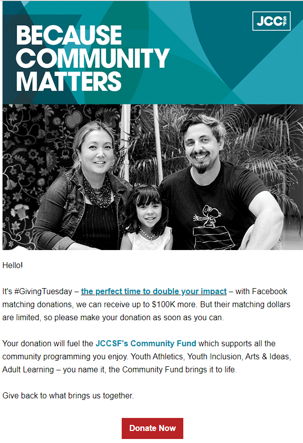
The only thing I like here is the headline: “Because Community Matters.” But the “because” has to tie back to why community matters. To what happens when people feel isolated, alienated and divided. None of that is included in this copy. Opportunity squandered.
5. What looks not so good?
The photo doesn’t illustrate the headline. This is a family, not a community. Wouldn’t it be preferable to show someone who looks like they need community support? Perhaps a frail, isolated senior? Or a sad, lonely child?
The donate button is at the bottom instead of the top. Plus it could be larger. There’s a lot you can do to make your donate button more of an integral component of your appeal, rather than an after-thought. In this case, it would work better if the language tied to the purpose of the gift – e.g. “Give to Create Community” or “Give to Bring People Together.”
6. Would it inspire you to give?
No! What exactly does “with Facebook matching donations we can receive up to $100K more” mean? This was so unclear to me it flew completely over my head. Subliminally I thought it meant Facebook had given a grant to match donations up to $100K. So I thought the fundraising goal was $100K (apparently that was incorrect, but… we’ll get to that in a minute).
That’s a lot of money, and it’s unclear to me why this much money is needed. The appeal is much too general. All I know is my gift will “support all the community programming (much of which I know charges a fee) you enjoy.” So… where does my money go? And how do they know what I enjoy?
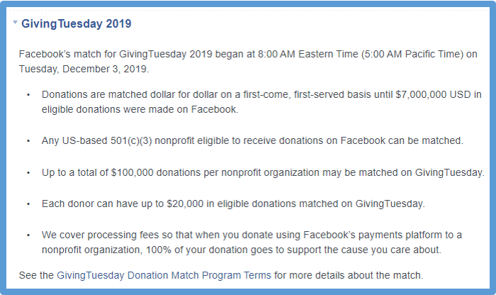
Clarity is further obscured with the addition of “their matching dollars are limited.” Limited by what? I interpreted this to mean they were limited to matching the first $100K raised. It’s an example of “insider talk” getting in the way of creating a donor-centered appeal. And by ‘insider,’ I mean someone on staff had learned the following from Facebook (which I only learned after I searched online for “Giving Tuesday Facebook Match” while writing this article):

Let’s get real. It appears FB only matches the first $7 million received. Since this organization is west-coast based (i.e., Giving Tuesday began 3 hours earlier on the east coast), what is the likelihood their supporters will give early enough to leverage any matching funds before they’re used up? It’s not as if the appeal said: “If you’re reading this at 5 a.m., make your gift now to leverage the nationwide match before it’s gone.” My hunch is it’s extremely unlikely any of the donations they received were matched. (I have a client who tried this last year with a west coast charity; only his personal gift was matched because he made a point of giving at 5:00 a.m.). Practical considerations do not warrant leading with this procedural reason to give.
7. If so, why?
If I’m already a donor, I might click on the “double your impact” link to see how my donation might be doubled. Donors do like leveraging their giving, and challenges can be effective motivators. They don’t stand alone, however. First you must make a powerful emotional call to action.
8. If not, why not?
For an offer to inspire it must connect emotionally. Aside from the headline, this appeal fails to make an emotional case for support. The creators may not have asked themselves “What do our donors care about?” Or maybe they just didn’t know, so threw up a bunch of spaghetti to see if anything might stick. The copy says “you enjoy,” but they clearly haven’t a clue what I enjoy. Perhaps it’s youth athletics… youth inclusion (whatever that means)… arts & ideas… “adult learning’ or “you name it.” Meh.
For an offer to inspire, it must depict a (1) demonstrated problem; (2) specific, workable solution, and (3) specific way the donor can create the solution. This appeal does none of these things. I always advise asking yourself “What would happen if this appeal is a failure?” This is a variation of “What would happen if you ceased to exist?” If the donor doesn’t get the message their gift NOW really matters, they’re unlikely to be inspired to give. Period.
Do you think the landing page is a “Do” or a “Don’t?”

4. What looks good about it?
Hmmn… cute kids? But…
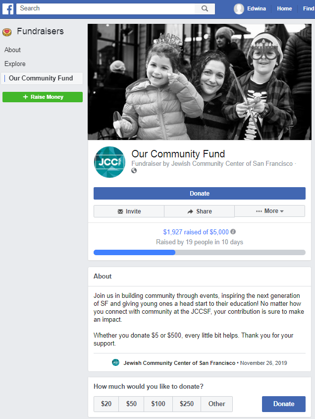
I still don’t know why this family, or anyone else, needs my help. In fact, they appear quite happy. They seem to be with their mom, celebrating the holiday of Hannukah. This too is a bit odd, since Giving Tuesday is December 3rd and Hannukah this year won’t arrive until December 22nd. Perhaps I’m being asked to give so other kids can enjoy a happy holiday? Who knows? I’m left to guess.
Not particularly inspiring.
5. What looks not so good?
I’m going to address the content here. In #7, below, I’ll address the platform.
- “Our” Community Fund is organization-centric. What exactly is the purpose of this fund, how big is it, and how much do you need to raise? Also, using the word “our” makes it seem like it belongs to the organization rather than the people. It may seem subtle, but you want to stay away from words like “our,” “we,” “us,” and “name of your organization.” Instead, use “you” and “your” as much as possible. “Your Community Fund” would be a great improvement.
- Out-of-the-blue $5,000 goal. The email copy indicated a goal of getting up to $100K matched. Yet here it says “$1,927 raised of $5,000.” This not only doesn’t match, it’s downright confusing. The disparity between these numbers is huge. All I could think was that they’d modified their goal downward to compensate for the fact the campaign was pretty much a failure. Donors don’t much like to jump on sinking ships.
- Relatively small amount raised to-date. See above. Sinking ship? Plus it’s only been three days since Giving Tuesday at the point of this screenshot, so why does it say “raised by 19 people in 10 days?”
- Small amount of donors who’ve participated. People like to join a movement. Generally, it’s a good idea to wait a bit before going public with your fundraising tally. So, unless you have a strong suspicion you’ll have a decent turnout for your event, maybe don’t put it on a platform that shares your progress in such detail?
6. Would it inspire you to give?
It did not work for me.
7. If so, why?
There’s a problem with this platform.
It’s Facebook. It’s not what I expected, which would have been a website donation landing page. This is because the appeal was received via email, not social media. It’s one thing to take prospective donors to a Facebook fundraising page if they’ve clicked on a link from social media; quite another if they may not even use this platform.
Whenever you take folks off your own, branded site to a third party site you dilute your message and risk arousing suspicion. Your prospective donor may think: “Is this where I’m supposed to be?” “Is this secure?” Anything that causes your donor to stop and think before completing their gift is a potential deal breaker.
8. If not, why not?
The case for support is generic. Appeals should ask for specific amounts for specific purposes. What do any of these things mean, really, and what impact will the donor’s gift have?
- “building community through events” How does this work, and what events are you planning? Where will my donation be used?
- “inspiring the next generation of SF” How does this work, and why is it important?
- “giving young ones a head start to their education” By doing what? And why do they need help?
Asking for “every little bit helps” isn’t inspiring. As noted above, copy like this causes donors to believe their giving will be a drop in the bucket. People aren’t dumb. They know their $10 won’t cure cancer, end hunger or “inspire the next generation.” So… it’s imperative you let donors know how their gift will help. At least add a sentence that says “your gift, together with the gifts of other generous people, will really add up and help move the needle.” Or “working together we can change the status quo.” Or “if everyone receiving this appeal makes a $10 gift, we’ll reach the $50,000 goal to (accomplish purpose of appeal – e.g., feed lunch to 50 more seniors… build a new on-site food pantry… underwrite after-school sports programs for 50 more kids…). Or ““Please give $3 to feed a hungry child.”
Lessons Learned
1. The email subject headline and preview pane matter. A lot. They’re what get your email opened or deleted. It doesn’t matter what’s inside if no one opens what you’ve sent. Make sure you include something that resonates with the constituency to whom you’re sending your email. Emotion is what moves people, not process. The fact it’s Giving Tuesday, or the end of the calendar year, is not an emotional reason to give.
2. The email copy must quickly convey a problem, solution and compelling (from the donor’s perspective) emotional call to action. Problems described should be specific, not broad. Solutions offered should tie back to the specific problem and seem realistic. Calls to action should enable the donor to feel heroic. In other words, your copy should tell a story of woe, explain how the outcome can become joyful, and show the donor how to be the hero who gives the story a happy ending. This can be accomplished quickly by using the right photo and a powerful caption. A big donate button, accompanied by a sense of urgency (why give now), can help assure people click on the link and go to your donation landing page.
3. The best donation landing pages match the appeal copy, design and graphic. They’re a part of your overall branding, and help reassure the donor they’re doing exactly what they intend to do.
4. Donor centricity is a must. If you don’t first get inside your donors’ heads (Ask: “What will our donors think of this? How will they experience it? What will it make them feel?”), you’ll likely not find the key to their hearts.
5. Remember to lift donors up! Generally, people want to help. And they’ll feel good when they do so. Your job is to facilitate the joy of giving. Don’t make donors feel guilty…oppressed… suspicious… or small.
What do you think? Am I off base? Please share in the comments below.
Need a Little More End of Year Help?
 I’ve got three easy-to-follow guides for you. Check ’em out!
All Clairification products come with a 30-day, no-questions-asked, 100% money back guarantee. You can’t lose.
To your success!


