 Here comes my occasional “Do’s vs. Don’ts” feature, where I share with you something arriving in my mailbox that seems a good ‘teaching opportunity.’
Today we’re going to review a fundraising campaign thank you email.
It’s very simple, which is why I’ve selected it. Because simple can be deceptive. So much so, in fact, that putting it together may seem unworthy of a strategic approach. Gosh darn it — we had a successful campaign and now we’re simply closing the loop and letting our community know it was a success. How much time investment is merited here, really? Come on! Just the fact we’re sending this is good, right?
Wrong. Alas, as the old adage goes, anything worth doing is worth doing well. Otherwise, you might inadvertently create an unintended consequence.
You may think I’m picking nits. Perhaps. But if you’ve got nits, they’re pretty uncomfortable. And that’s how this email made me feel. Except… for the parts that didn’t make me feel that way. This email is a melange of do’s and don’ts.
We’ll take a look at the various elements; then assess what works/doesn’t work.
There’s (1) a subject line, (2) the email itself, and (3) what happens if/when you click through and are transported to the donation landing page.
I’ll ask you some questions.
- Would you open this email?
- If yes, why?
- If no, why?
- What looks good about the email?
- What looks not so good about the email?
- Would it inspire you to click through?
- If yes, why?
- If no, why not?
- Once you click through, would you be inspired to take action?
- If yes, why?
- If no, why not?
First, I’d like you to think about your answers and jot them down.
Second, I’ll tell you what I think.
Third, if you disagree with me please let me know in the comments below.
Really take the time to notice what you like and don’t like.
I promise you’ll learn a LOT more this way. We learn best by doing.
Seriously, I mean it.
Let’s begin at the beginning.
Subject Headline
“We did it!”
This may help: Take three minutes and jot down your answers to the first three questions on a piece of paper or your screen. I want to know if what was in the subject headline would have caused you to open the email or hit ‘delete.’ If you’d open it, why?
Okay. Ready to learn what I think thus far, and also see what else we’re working with?
Let’s begin!
Does this Email Say “Open Me?”
What’s wrong or right with this subject line?
We did it!
Remember: Your email subject line and preview pane are the online equivalent of the direct mail envelope. You need to begin a conversation, perhaps arouse curiosity, and maybe flatter the recipient so they’re in a receptive mood.
This subject line straddled the line. The “we” was unclear, so perhaps a bit of curiosity was triggered. The same holds true for the “it.” However, “You did it” would’ve worked SO much better. Did you know “you” is one of the five most powerful words in the English language?
POWERFUL ACTION TIP: To make philanthropy about your donor’s experience, not yours, use “you” rather than “I” or “our” or “your organization’s name” or “we” (unless it’s “we, together”). Cross out all the ego-centric stuff in your copy and rewrite. No exceptions.
Does This Email Message Inspire Action?
What looks good about it?
Again, I beseech thee to take a few minutes to think this through yourself before you look at my thoughts.
What do you especially notice?
What do you like? Not like?
Don’t cheat and scroll down to what I have to say.
You may disagree, and I’d love to know your thoughts. Your thoughts matter!
Okay?
Ready?
Here’s what I think…
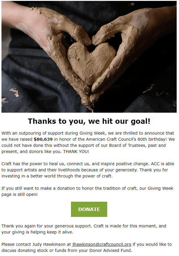
1. It’s a nice opening image.
DO: It starts out with a visual that reminds me of the organization’s mission. Not only craft, but sharing the love of craft. And the healing power of craft. To me, this photo even channels the iconic image of Patrick Swayze in “Ghost,” cradling Demi Moore as she works at her potter’s wheel, remembering their love. Nice pick!
2. The opening line/caption starts donor-centric; then switches lanes.
DO: “Thanks to you…” This makes me feel I did something worthy of gratitude. [Note: I did not actually give to this particular campaign, but have given in the past. Nonetheless, it’s okay to presume a former donor, or even a non-donor, is a generous person because it does make them receptive to considering a donation. That being said, ideally you’d send non-donors a slightly different version of this “campaign’s last gasp” email, perhaps indicating “craft lovers like you made average donations of $50. You still have time to get your anniversary campaign donation in to make this the biggest year ever for supporting struggling artists who make our world more beautiful. You make it possible!”]
DON’T: “… we hit our goal.” I no longer feel responsible for an outcome I care about, because it’s their goal. And what goal was that? Apparently a monetary one.
DON’T: The caption misses the opportunity to refer to, and complete, the visual. Most people will look at images before everything else and, as they say, they’re worth 1,000 words. Add a caption that makes your case for support, and you need very little else. What if this had led with “You showed your love for craft“? Or “You supported the artists who heal our world, every day“?
3. The first paragraph continues with the organization-centric language.
DON’T: Three “we” and one “our.” Plus, I get the impression most of the money came from the board, past and present, and I’m not a member. It makes me almost feel like I’d be an outlier if I donate at this point. In other words, I don’t feel needed. And the addition of “and donors like you” doesn’t help make me feel like a member of their community, because it’s too vague. It is good to make donors feel they’ll be joining a group of like-minded helpers. After all, we’re wired towards connecting with community. However, more specificity is required so folks can imagine themselves communing with a group with whom they identify (e.g., “other craft fair attendees like you;” “other dedicated members like you;” “other art lovers like you;” “otherSan Franciscans like you,” etc.).
DON’T: I learn the goal was $80,000 for their 80th year. I appreciate the symbolism, but it otherwise seems random. What is this $80,000 going to accomplish? Is it something I care about? If I give them more at this point, do they need it? What will they do with it?
4. The second paragraph has the heart.
DO: The first sentence would have made a better opener/photo caption than the monetary goal. Remember, for donors it’s not about the money but the outcome achieved: “Craft has the power to heal… connect… inspire postive change.” Ah, yes! You’ve reminded me about something I value.
DON’T: Again, it uses organization-centric language saying they (not the donor) are the ones supporing artists and livelihoods (because the donor gave money). All that’s required is a lingquistic tweek (e.g., “Your investment in the craft community supports the artists who make our world a better place.”).
5. The third paragraph is a call to action.
DO and DON’T: If the purpose of this email was fundraising, then this paragraph is essential. If the purpose was to make donors who just gave feel good, then it misses the mark. Generally, it’s a bad idea to mix a thank you with an ask. That’s why segmenting this mailing (i.e., donors vs. non-donors) would have been a good idea.
DON’T: You may care about your “Giving Week,” or anniversary, or campaign, but donors care only about the outcome. Never forget this. Otherwise, you’ll get lost in your internal processes. Think from the donor’s perspective.
6. The fourth paragraph is unnecessary and confusing.
DON’T: I get a sense they felt a need to create some urgency about giving now, even though the campaign concluded and reached its monetary goal. So they added this bit about how “craft is made for this moment.” I can imagine, with all the turbulence the world has experienced over recent years, to what they’re referring. But it takes too much thought on my part, and that’s if I even read this far. Make your case for support at the outset, not as an afterthought when you worry you didn’t do so strongly enough.
7. The fifth paragraph has useful contact information and suggested ways to give.
DO: It’s always a good idea to name a specific individual to whom donors can direct their inquiries. Here they include both a name and an easy email link.
DO: Suggesting donors might want to (1) give stock or (2) recommend a gift from a Donor Advised Fund (DAF) is brilliant, and way too few organizations do this. (1) Research shows organizations who receive stock gifts achieve 66% growth vs. 11% growth for those receiving only cash gifts. (2) More and more donors, including those currently making small gifts to you, have DAFs. There are billions of dollars sitting undistributed in these philanthropic wallets, and donors sometimes forget the money is there. Or it’s too much trouble to take the extra step of leaving your landing page to go to their DAF manager’s website and make the transfer. Do whatever you can to remind them, show them you welcome these gifts, and facilitate their giving.
Does The Donation Landing Page Inspire Action?
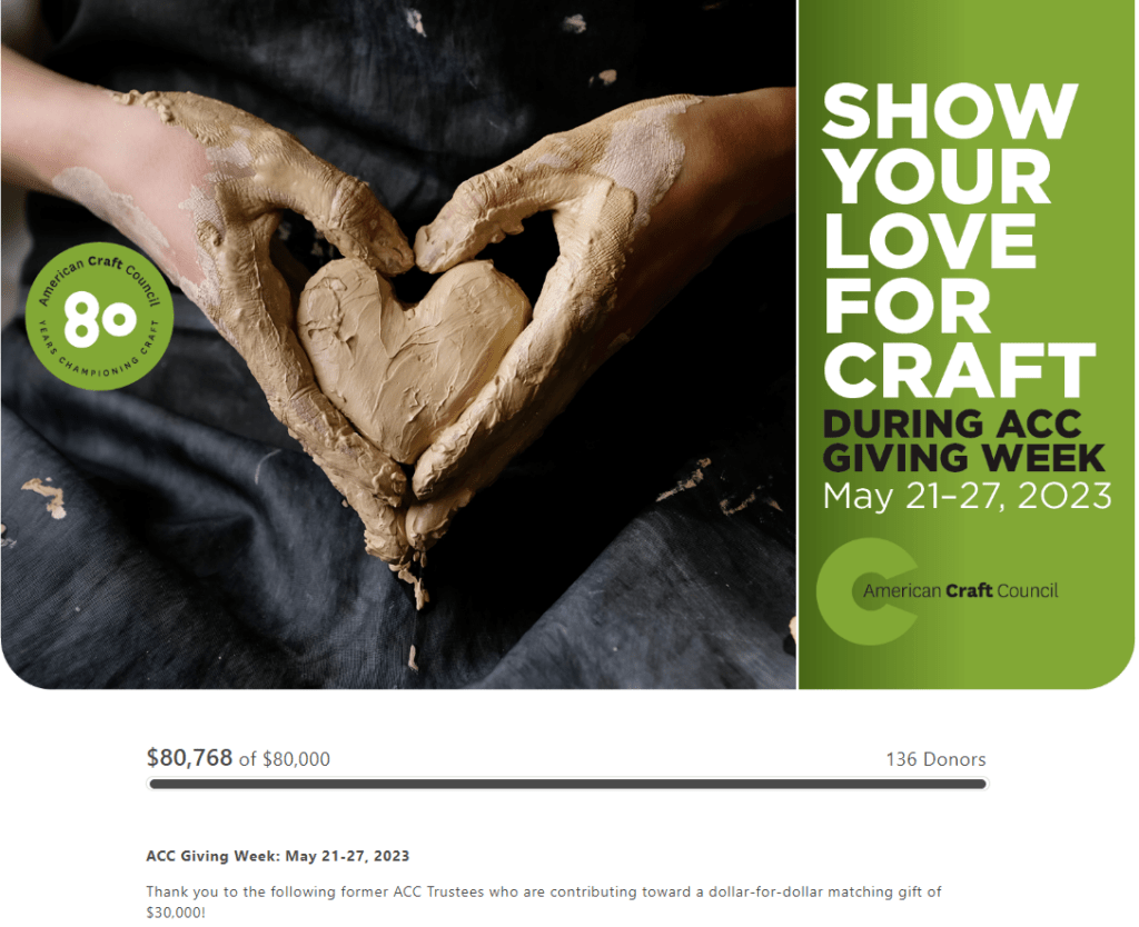

[NOTE: I omitted the list of trustee names that appear on the website here. Would I recommend including it? It depends. Do you think these names will inspire copycat giving? Or will they deter it? Will would-be supportes think “Oh, if Ann can do this I can too?” Or will they think “Oh, if they’ve got all these deep pockets giving they don’t need me?” A lot depends on how tight and connected your donor community is. Generally, I prefer to recognize donors elsewhere and keep donation landing pages clean and stripped down. ]
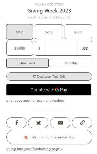
Mostly, DON’T, DON’T, DON’T.
- If you’re going to take folks to a special landing page, make sure it’s up to date. I receive this email on June 28th and the Giving Week ended May 27th! Why not create an updated page that switches up the language a bit to match the email. Perhaps call it the Anniversary Campaign.
- What about showing you’ve already raised more than you set out to raise is compelling? This just makes me feel they’re nickel and diming, especially since they don’t give any reasons for needing to raise more. Don’t fail to be explicit about what the additional donor dollars will make possible.
- What about showing you only have 136 donors makes me feel I’ll be joining a warm, welcoming community? I know this is a national organization, and more people than this attend every fair. So why are so few people giving here? It makes me feel I might be a chump if I do so. Plus, I can do math. At an average gift of $594, this may not be for me.
- What exactly is this $30,000 matching gift about? This is confusing. It wasn’t mentioned in the email, it doesn’t relate to the total $80,000 goal, and I have no idea if it still exists or if it’s all been used. If it’s not motivating, don’t include it. Anything that causes your potential donor to stop and think is hurting your efforts.
- I’m really curious if anyone created their own peer-to-peer fundraising page for this. I may be off base, but it seems like they purchased some cool software and are now just throwing it out there. The software, and concept, is cool. It’s just not explained in any compelling way here. And why would someone do this for a campaign that’s already concluded? Again, don’t add unnecessary stuff to your donation landing page. You don’t want the donor to think “Oh, maybe I’ll come back later and see if I can figure this out.” Later seldom happens.
Here are a few “DO’s”:
- The preselected default amount. This is a good idea if you’ve done some research to determine what average gift amounts are for your donors. You may need different defaults for different donor segments.
- A suggested ask string. It’s good to give donors an idea of what you expect or need. This does so. I just wonder if it’s too high. This is something you could test.
- Offering different payment options. This is swell. Just be sure when you do this you offer some indicator of security since you’ll be taking donors off your website onto third-party sites.
- Use of the same photo and branding as the email.
- It makes the case for support, generally.
Key Lessons Learned
The unintended consequence of this email is I’m left feeling they don’t really need my philanthropic support. They have enough, including some wealthier supporters who will likely see them through.
I”m also left feeling a bit fuzzy on what they do with the money they raise. It’s a shame, because I”m generally a fan of the mission. I just need a reason to give to them, rather than to some other deserving arts organization.
While I don’t suggest you wordsmith every word — no one has time for that — I do encourage you to learn, and adhere to, the fundamentals. With these rules as a framework, you’ll have the tools to nail your communications more often than not!
Fundamentally:
- The email subject headline matters. A lot. It’s what gets your email opened or deleted. It doesn’t matter what’s inside if no one opens what you’ve sent.
- The email copy must quickly resonate with the reader. Here the headline didn’t flatter me or make me feel good. It felt like it was all about them and the money.
- The email copy must quickly get to the point. They led with their process, not what my gift would accomplish.
- Donor centricity is a must. If you don’t first get inside your donors’ heads (Ask: “What will our donors think of this? How will they experience it? What will it make them feel?”), you’ll likely not find the key to their hearts. If you make them like you, and show them how the values your organization enacts are the values they share, you’re more likely to get the action you desire.
- Images help. A lot! They are seen first, convey in an instant what copy takes longer to comprehend, and when paired with a good caption can make your entire case for support.
- Defaults make it easy for donors to know what you expect from them. When you highlight what you want, you’ll more likely get it. Just do some research to consider the right default to select.
- Ask strings help donors know how much to give. Carefully consider the amounts. Ideally describe what those amounts make possible. Generally, don’t worry about coming up with a different purpose for different amounts. Use the same purpose, and multiply the amount or time period.
- Landing pages should conform to the email. Consider every element of your strategy, and strive to make them reinforce one another. Strip out anything distracting from the primary action you want a donor to take.
- Include a compelling call to action. Or, if it’s intended as a pure thank you, don’t. Always, always begin with your “why.” Why are you sending this? Will the donor understand? Might there be a better way to accomplish your goal?
What do you think? Am I off base? Anything to add? Please share in the comments below.
Want More Help with Your Fundraising Appeals?
 You may find my Anatomy of a Fundraising Appeal Letter + Sample Template.useful. It’s a simple, incredibly thorough, 62-page step-by-step guide to crafting a killer appeal letter or email appeal. If you speak straight to the heart – and to your donor’s passions — you’ll raise more money.
All Clairification materials come with a 30-day, no-questions-asked, 100% refund guarantee. If you’re not happy, I’m not happy.
Please note: Often I can’t omit the name of the charity in the examples I use. Today’s example has “do’s” plus “don’ts,” so hopefully I’ve not offended. Please know I always come from a place of love, and don’t mean to shame anyone. As with almost anything you can think of, there’s good AND bad in the examples I share. We learn both from mistakes and stellar efforts. Our own, and others. Kudos to all who put things out there and make an effort. The only way you learn is by trying. If I ever use you as an example, and you disagree or want to clarify, feel free to contact me directly.
