What makes your appeal stand out in a crowd?
When asked what my favorite carrier envelope is for a fundraising appeal, my standard answer is:
One that screams “open me!”
Of course, there are a variety of reasons an envelope may beg to be opened.
And an equal number of reasons why it may scream “dump me in the trash.”
Today I want to help you avoid the trash bin.
And, good news – it’s not that difficult.
You don’t need to be a direct mail expert.
You don’t need to run a zillion A/B tests.
You just need to exercise some good old-fashioned common sense.
First, think about what gets you to open an envelope.
I’d love for you to do some noodling on this now – before you read further.
In fact, if you want to do something really helpful, STOP reading this article, convene a few colleagues, and do a little group brainstorming. Ideally, get your answers up on a whiteboard or other group memory so you can piggyback off of each other’s ideas. [Go do this now; come back to this article later.]
If you’re not prepared to play along (I get it, you’re busy), here’s a sample I’m sharing from a brainstorm I did with another nonprofit:
Reasons I open envelopes:
- Personally addressed
- Have human handwriting
- Look like they’re from a friend
- Look like an invitation
- Are over-sized or odd shaped
- Are colored
- Have live, commemorative stamps
- Seem lumpy, like there are contents inside
- Say there are gifts inside
- Seem to be offering a good deal; time-limited opportunity
- Have a provocative question to which I want the answer
- Seem urgent
- Suggest I may miss out if I don’t open
- Unclear what’s inside or who it’s from; can’t risk tossing it.
Reasons I toss envelopes without opening:
- Anonymously addressed (e.g., “or resident”)
- Clearly a sales piece
- Looks like a bill, but fake
- From a charity I don’t know or care about
- Tagline isn’t believable
- Has a window
- Too glossy and slick
All these reasons should inform your strategy.
Here are the top reasons potential donors may open your envelope.
1. It’s a Mystery
My go-to envelope for a fundraising appeal is one that is as blank as possible.
If you’re mailing first class, you don’t even need to use your organization’s name on the return address. You may think everyone will recognize “1600 Scott Street” as belonging to your organization, but they won’t. You live and breathe where you work; your constituents do not.
It’s a “teaser” without teaser copy, because the recipient isn’t sure who it’s from or what’s in it.
People can’t pass up a good mystery.
TIP: You can create even greater incentive to open your envelope by piggybacking on this strategy with another good strategy. One I like is having a volunteer handwrite their name above the return address (this should be paired with a handwritten note from them on the appeal that’s inside). The fact there is handwriting is good, as it looks personal. And even if I don’t recognize the sender’s name, I’ll think I should if they’ve taken the time to hand write their signature.
2. It Looks Fun
I love an envelope that makes me think “oh, goodie!”
In other words, I think “what a delightful change to receive some welcome mail; this isn’t just junk.”
I have one envelope sitting on my counter right now I’m waiting to open for a moment when I need a little lift. It’s brightly hued turquoise, over-sized, and looks like it might include information about a fun event. I have another that made me squeal “Oooh… it looks like real handwriting, and maybe this is from someone I know!” I’m pretty sure it’s an early birthday card from an old college roommate, but I’m letting it sit awhile to build the anticipation.
What could you do to make your fundraising appeal envelope look like a birthday card, invitation or announcement of something fun, creative and enticing?
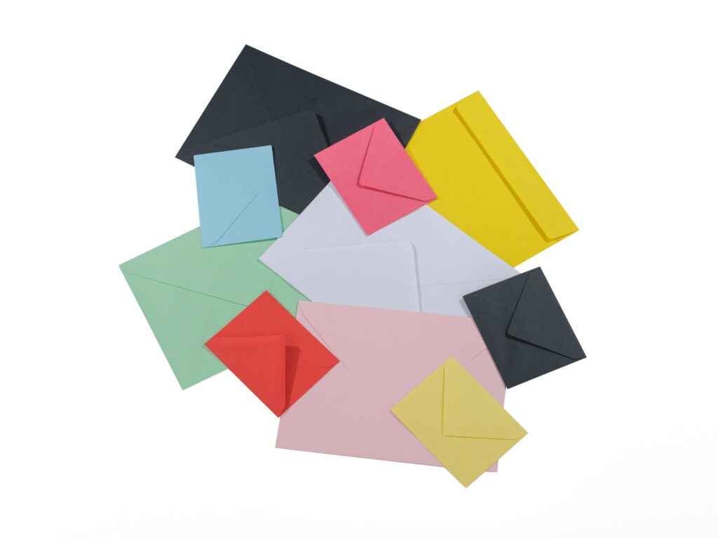
TIP: Colored envelopes work wonders. Yes, they’re a teensy bit more expensive than white, but you can buy stock envelopes without paying for printing. They don’t even have to match the color of the appeal design inside. Once the envelope is ripped open, it’s done its job. No one will care if the envelope is green and the appeal uses a blue logo.
3. It Looks Urgent
If I’m looking for a way to help, and you show me the way, I’ll be grateful.
Generally I’m not a huge fan of teasers, because they’re tricky to get right and can do as much harm as good. But not in the case of an emergency.
- Right now any envelope indicating you can “help save democracy” would get my attention.
- Four years ago a teaser on the envelope showing I could “keep artists and theater alive” through the pandemic would have made me take notice.
- Or maybe you have an evergreen emergency like “The U.N. says we only have 2 years to save the planet.”
When something is in the news, and top of mind for almost everyone, you have a real opportunity to meet folks where they are.
TIP: Even if you’re not a frontline responder, there are ways to demonstrate your solidarity and usefulness. One local charity I support partnered two years ago with another local charity to build a list of organizations who are direct responders; This happened to relate to the situation in Ukraine, but you could easily do this for other disasters like hurricanes, fires and floods. The fact they did this made me think more highly of both of these charities. What about an envelope with the teaser “List of ways to help fire victims inside?”
4. It Triggers FOMO
Fear of loss weighs heavier than hope of gain.
One of the psychological principles of persuasion (Robert Cialdini) and behavioral economics (Daniel Kahneman and Amos Tversky) is loss aversion, or “fear of missing out.” We human beings will bend over backwards to avoid a loss. And scarcity scares us into action.
You can use your envelope to trigger this FOMO.
TIP: If you have a matching challenge, consider a teaser such as “Double Your Money… Before June 30.” Direct mail whiz Jeff Brooks suggest you might pair a message like this with a bit of mystery, using a tagline like: “$50 = $100… and more opera.”
Here are specific tactics to get your envelope opened.
Just to give you a summary of useful tactics, I’ve synopsized the following from some previous articles, including: Open Sesame! How to Keep Your Fundraising Appeal Out of the Trash.
- Use a live stampif you can. It looks less like junk mail. A commemorative stamp that ties in with your cause or the timing of the mailing is especially lovely.
- Choose a plain, smooth envelope. Window envelopes are impersonal.
- Consider a colored envelope to catch folks’ attention. Or a plain envelope without your name/logo. If folks can’t tell what it is, then they can’t toss it. It might be a letter from a friend. [Of course, use common sense. If your donors adore you (perhaps you’re a school or hospital or arts organization they frequent), then they’ll open an envelope they know is from you].
- Consider an oversized envelope. This is another trick to get folks to take notice since it stands out in the mail. Of course, it requires extra postage and this can backfire, making folks think you’re using money for the wrong purposes. It works best for event invitations rather than annual appeals.
- Consider a teaser that’s impossible to resist (e.g., 3 cancer-preventing foods inside… special gift inside…double your money… ). Direct mail fundraising guru Mal Warwick describes a range of needs that can be accomplished with a teaser, ranging from describing what’s inside to asking a question to starting a story. He also says “Often the best teaser is no teaser at all. Fundraising letters are almost always crafted to mimic personal letters, so teasers may well cheapen or undermine the effect the writer wants to achieve.” Use some judgment. And ask folks outside your office if the teaser would turn them on or off. And begin your own collection at home, noting which teasers get you to open the envelopes and which you’d be inclined to toss.
- Consider handwriting the address. If not feasible for everyone, do it for your best prospects. Or simply hand write the name of the person from who the letter is being sent over the return address. Some handwriting is better than none.
Want More Help With Fundraising Appeal Tactics?

This 62-page e-Guide is a surprisingly quick read — and a true road map to creating a winning fundraising appeal.
Get my Anatomy of a Fundraising Appeal + Sample Template — a thorough e-Guide with everything you need to put together an offer your prospect can’t possibly refuse!
This is super practical stuff I’ve learned over the past 30+ years. Plus I’ll explain to you why I’m suggesting you take the recommended actions — so if anyone tries to dissuade you from doing what you know works, you’ll have the ammunition you need to stick to your guns. That’s how you’ll raise more money.
I guarantee you’ll raise way more than the modest cost of this Guide. If you’re not satisfied, you have my no-questions-asked, 30-day, 100% refund guarantee.
Photo by Sharon McCutcheon on Unsplash
This 62-page e-Guide is a surprisingly quick read — and a true road map to creating a winning fundraising appeal


