 Here comes my occasional “Do’s vs. Don’ts” feature, where I share with you something arriving in my mailbox that seems a good ‘teaching opportunity.’
Today we’re going to review a year-end annual direct mail appeal strategy.
We’ll take a look at the various elements; then assess what works/doesn’t work.
I’ll ask you some questions.
- Would you open this letter?
- If yes, why?
- If no, why?
- What looks good about the mail package? The letter? The remit?
- What looks not so good about all these package elementsl?
- Would it inspire you to give?
- If yes, why?
- If no, why?
First, I’d like you to think about your answers and jot them down.
Second, I’ll tell you what I think.
Really take the time to notice what you like and don’t like.
I promise you’ll learn a lot more this way. We learn best by doing.
Seriously, I mean it.
Let’s begin at the beginning.
Carrier Envelope
Some identifying information has been removed for purposes of confidentiality. I’m not here to shame. Just to teach.
- Would you open this letter?
- If yes, why?
- If no, why?
I’ll wait…
Have your answers?
Okay!
Ready to learn what I think thus far, and also see what else we’re working with?
Let’s begin!
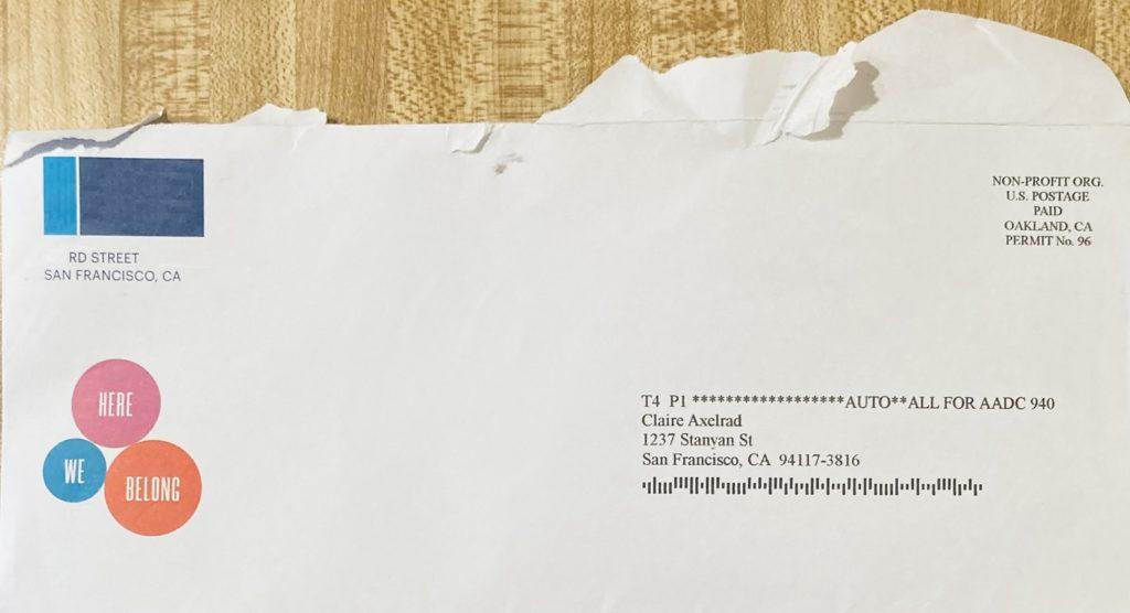
What’s wrong or right with this envelope?
This envelope is a snoozefest. To me, it screams “dump me in the trash.” Were I not an ever-curious fundraiser, I probably wouldn’t have opened it.
- It’s boring white color means it doesn’t stand out from other mail.
- It’s a standard business size, also not making it stand out. Did you know at 37%, oversized envelopes have the greatest household return on investment over other mediums (followed by postcards and letter-sized envelopes at 29%)?
- There is nothing personal about it; clearly a mass mailing.
- The nonprofit indicia, in lieu of a live stamp or even first-class metered postage, reforces the fact this is bulk mail.
- My husband’s name was spelled incorrectly (I edited his name out of the photo, so you can’t see this; just trust me).
- The “teaser” isn’t teasing anything compelling; it’s just three meaningless words. Who is “We?” Where is “Here?” “Belong” to what? They may have thought this would arouse curiousity? Not really. The only thing I like about it is the pop of color.
- There’s a logo with return address (edited to preserve anonymity); nothing mysterious; it screams “solicitation.”
Appeal “Letter”
INSIDE
OUTSIDE
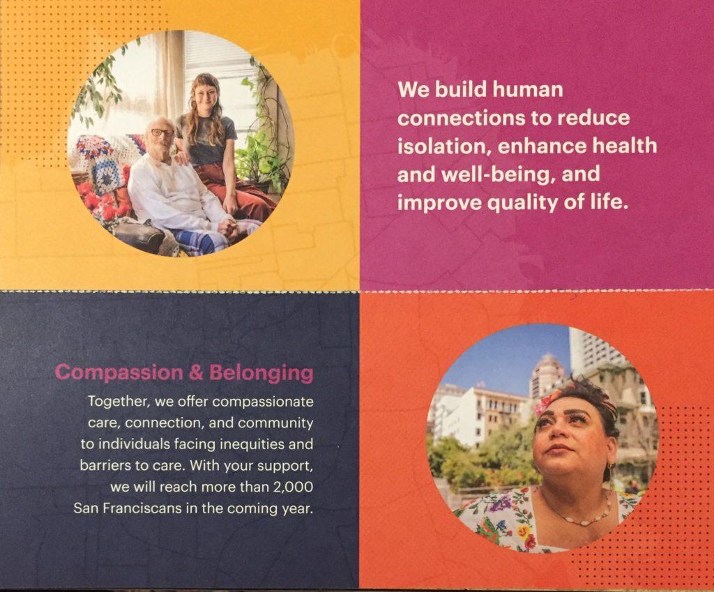
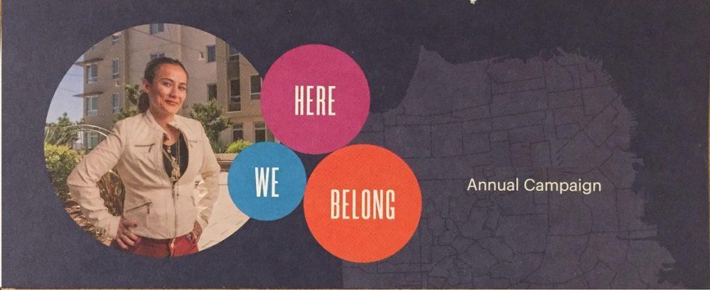
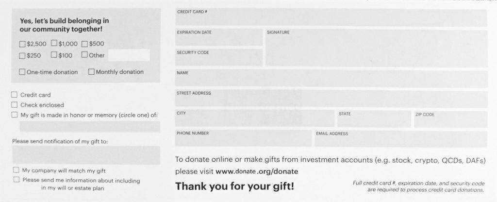
NOTE:This was a fold-over piece on hard card stock. The “cover” was the piece shown here in the middle: “We. Here. Belong.” When you opened this, you saw the 4-square grid with photos in two squares and text in the two other squares (they happened to be upside-down, a design flaw). There was a perforation, so you could tear off the remit (shown at the bottom).
- What looks good about the mail package? The text? The visuals? The remit?
- What looks not so good about all these package elements?
- Would it inspire you to give?
- If yes, why?
- If no, why?
Again, I’ll wait while you think a bit…
Really take the time to notice what you like and don’t like.
I promise you’ll learn a LOT more this way. We learn best by doing.
Have your answers?
Okay!
What’s wrong or right with this appeal?
This is not an appeal letter. It’s an insert or brochure masquerading as one. As such, it has none of the elements of an effective fundraising letter. None. Brochures kill direct mail fundraising. I was not inspired to give, because I really have no idea what my gift would have been used for.
TEXT
- No personal salutation. Why? Because there’s no letter.
- No signature from someone I might trust. People give to people, not institutions.
- Headline text is institution-centered, not donor-centered. The biggest secret to success with a fundraising appeal is generous use of the word “YOU.” Instead, they use “WE.” Try to stay away from institution-centered words like “we,” “our,” “us,” and “your organization’s name.” This “cover text” doesn’t really make me want to open the piece, because I don’t see myself in it.
- Virtually no case for support. When your “raison d’etre” could apply to dozens of other nonprofits, you aren’t making a case to support you instead of any of those others. These phrases are not distinguishing; one can google them and get zillions of similar results (e.g., “we build human connections”; “reduce isolation, enhance health and well-being;” “improve quality of life;” “compassionate care, connection and community to individuals facing inequities and barriers to care”). I’m sure to this organization, steeped as they are in their mission, these phrases seemed central to their definition. But, to an outsider, they’re not really defining (i.e., “giving information about someone or something that is necessary in order to understand who or what is being referred to. They’re vague.
- No ask. Beating around the bush doesn’t work well. There’s only an oblique reference in the appeal text: “with your support we will reach…” There’s another vague ask on the tear-off remit: “Yes, let’s build belonging in our community together!” Say what? When the donor is being asked to give, they need to know (1) how much you need/want from them, and (2) specifically how their gift will be used to resolve the problem you’ve presented. This does neither.
- No urgency. Why is my gift needed now? There’s no challenge grant. No deadline. Psychologically, when you can create some sort of urgency or deadline, you’re more likely to inspire current engagement.
- No “feel good.” Were I to know what’s being asked of me, and why, I could anticipate feeling good because I’ve been helpful. Did you know MRI research shows people get a ‘feel good’ shot of dopamine when they even contemplate giving? That’s right; directly asking people to help you is a good thing!
VISUALS
- A picture can be worth 1000 words, and a picture + caption + call to action (CTA) can encapsulate your entire message in the blink of an eye. This is valuable real estate you don’t want to waste. Unfortunately, they don’t make good use of it in their choice of photos, lack of caption and lack of CTA.
- When you show real people, this improves response. Especially when you show faces with eyes that seem to be looking right at you; this triggers human empathy, making the message go to the heart, not the head. . Alas, these photos look like they could be stock photos.
- No close-ups. You can barely see the eyes in the top photo; the second photo has the eyes gazing upwards (to where?), and the bottom photo has a self-satisfied look that doesn’t really draw the reader in. All of these would benefit from an edit that closed in on the facial expression.
- Happy or neutral, not sad (i.e., clearly in need of help). The best appeal photos demonstrate the problem, not the solution. Generally, sad photos or photos of people being helped (e.g., a home help aide giving food, helping with a walker, giving a big hug, etc.) work best in appeals (show a problem you hope the donor will want to address) while happy photos (show the solution the donor made possible) work well in thank you’s and reports. This isn’t a hard and fast rule, so don’t argue with me if you’ve raised money with happy photo appeals. I have too. It’s just something well worth testing for yourself — because maybe you could be raising even more money! See more here about how to choose compelling photos.
- No captions to add needed context. This is a place to add a bit more specificity around both the problem and solution, neither of which jump out at the reader in this appeal. The top photo is best; it at least implies a volunteer visit from a young girl with a senior. But the reader/viewer still has to guess. What if underneath the photo is said “I love hearing Fred’s stories through the grandparent/teen friendly visiting program?” The other two photos? Completely unclear what’s going on.
- No CTA tied to the photo and the problem/solution it depicts. Were this an email appeal, you could have a donation button under each photo (e.g., “Support the Friendly Visiting program to boost longevity by reducing isolation.” )
REMIT
- “One size fits all” generally fits no one well. The ask range is on the high end for a bulk-mailed piece, generally used for prospective, not current, donors. How many people will check $2,500 from the information included in this package? My hunch: not many. It would be better to skew lower, and include some amounts more likely to be given by a first-time donor. (i.e., $500, $250; $100; $50; $25 and other). And since they offer the option to check “monthly,” it might make sense to skew even lower.)
- The ask string should probably be arrayed in ascending order. Though I’ve seen data suggesting high to low performs best (and even no ask string) the latest research indicates low to highis probably best. This is especially true for non-donors and lapsed donors as you want to ease them into giving. This would be something it would be great to A/B test for your own nonprofit. Whatever you do, it shouldn’t be an afterthought; there’s a real science behind ask strings.
- There’s no mailing address on the remit card. Though a return mailing envelope was included, it’s good practice to print the mailing address in case the card and envelope get separated. It’s good they also included a URL for those who prefer to give online or in some manner other than a mailed check.
- The call to action is vague. This remit has no photos and nothing to remind the prospective donor of the problem their gift will solve, save for the “Yes, let’s build belonging in our community together.” That phrase could be, off the top of my head, a CTA for the chamber of commerce, United Way, school PTA or hundreds of other causes. If I saved this remit to pay with my bills, I’ll have forgotten why I saved it and be very likely to toss it rather than following through with a gift.
- It’s good they include the option for tribute giving.
- The matching gift box is a good reminder.
- The estate plan check box is good to include.
Key Lessons Learned
- The most important element of a fundraising appeal package is the carrier envelope. This is what gets your appeal opened. If it’s not opened, nothing else matters.
- The second most important element of a fundraising appeal package is the letter. Brochures don’t add value. They’re impersonal, tend to be institution-centered, and often they beat around the bush when making a concrete ask for a specific donation to resolve a specific problem.
- Copy must quickly get to the point. It must tell people what they need in order to perceive a problem that resonates with them, and see how they can be part of the solution.
- Donor centricity is a must. If you don’t first get inside your donors’ heads (Ask: “What will our prospective donors think of this? How will they experience it? What will it make them feel?”), you’ll likely not find the key to their hearts.
- Photos must be compelling to be worth 1,000 words. Sad photos of faces looking directly at the reader work best to depict a problem in need of a solution. Using a caption helps put the photo into context, making the donor better understand your mission in action.
- The remit piece anchors your call to action. It should be able to stand alone, in case it gets separated from the mailing. Specific calls to action get the most engagement. Be clear what the donor’s gift will accomplish, and clarify why it is needed right now. You are competing with hundreds of other charities, so you must make a compelling case for how much you need and why it is better deployed here than somplace else.
Please note: Please know I always come from a place of love, and don’t mean to shame anyone. As with almost anything you can think of, there’s good AND bad in the examples I share. We learn both from mistakes and stellar efforts. Our own, and others. Kudos to all who put things out there and make an effort. The only way you learn is by trying. If I ever use you as an example, and you disagree or want to clarify, feel free to contact me directly.
You may disagree, and I’d love to know what you think. Your thoughts matter! Please share in the comments below.
Want More Help with Fundraising Appeal Strategies?
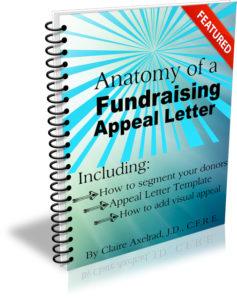 You may find my Anatomy of a Fundraising Appeal Letter + Sample Template.useful. It’s a simple, incredibly thorough, 62-page step-by-step guide to crafting a killer appeal letter or email appeal. If you speak straight to the heart – and to your donor’s passions — you’ll raise more money.
All Clairification materials come with a 30-day, no-questions-asked, 100% refund guarantee. If you’re not happy, I’m not happy.


Excellent advice — as usual — so a big THANK YOU! is in order from your “students,” Claire. Best wishes!
Thank YOU!