 Recently, fundraising copywriting and thanking guru, Lisa Sargent, posted a list of “small stuff” it’s absolutely important to sweat. It took me decades – decades! — to learn this on my own in the trenches, and I’d have given anything to have had a mentor like Lisa to clue me in from the get-go. Lucky for you, you won’t have to muddle through on your own. My motto has long been: “If I know it, I want you to know it!”
I’m sharing Lisa’s list here with you, together with a few extra tips (the green ones) suggested by some of her readers. And I’m elaborating a bit (from my own experience) on the all-important WHY.
“Yes, fundraisers, there is a reason…
– For uncoated paper
– For tabbed paragraphs
– For 12-14 point font
– For incomplete sentences
– For unresolved stories
– For repetition
– For emotion
– For white space
– For asking
– For asking again
– For thanking
– For thanking again
– For captions with photos
– For quirky formatting
– For postscripts and page turns
– For weird outer envelopes (and plain ones too)
– For urgency when it’s urgent
– For sweating small details
– For clarity above all
There is a reason: heartfelt donations and happier, more engaged donors.”
Okay, let’s take these one by one.
1. Uncoated Paper
The principal reason I don’t use coated paper is it creates a perception you spared no expense. Even if the coated option is cheaper, people will think it was more expensive. And perception matters (though keep in mind perception can vary across audiences). Other reasons are that it’s more difficult for older eyes to read print on glossy stock. Plus, if people have to complete a donation remit piece, it can be difficult to write on it with a regular pen. Lisa notes sometimes the coated paper cracks when it’s folded. While I’ve never experienced this myself, this reminds me to suggest you stay away from heavy stock that might crack. Like glossy stock, heavy stock appears pricey.
2. Tabbed Paragraphs
Reading studies reveal indents allow eyes to take a bit of a rest, helping folks transition to new ideas and topics This makes it easier for people to continue reading your all-important prose and call to action. Huge chunks of unbroken text are hard to grapple with.
3. 12-14 Point Font
If it’s not easy to read, people won’t read it. For years, 12-point type size was the standard size recommended for letters. Smaller than that is hard to read for the average person. For seniors, anything smaller than 14-point is difficult. And since you generally don’t know the age of your message recipients, I actually recommend 14-point for everything. It’s better to require the reader to flip the page to continue reading than to stuff everything into one page with teeny type they’ll struggle with. NOTE: Different fonts set at the same type size won’t necessarily look the same; let your eyes be the judge.
4. Incomplete Sentences
You want your letter to come across the way you talk. This makes your message relatable, and easy to understand. People talk in incomplete sentences. They begin sentences with contractions. People don’t want to read a term paper. Using precise grammar will make you appear stuffy. “Who did she need to talk to?” is much easier to read than “To whom did she need to talk?”
5. Unresolved Stories
Effective fundraising must be about the donor, not about you. If you talk about what you’ve already accomplished, the donor will see no reason to jump in to give the story a happy ending. The best story for fundraising is an incomplete one. Donors must feel needed or they won’t be compelled to act. Be sure to ask your donor to solve the problem.
6. Repetition
Busy people scan appeals. They multi-task. You never know precisely what they’ll see or not see. For that reason, it’s important to repeat your main message (emotional, case for support right now) multiple times. The same holds true for your call to action. Reader A may see it in the headline. Reader B may see it in the postscript. Reader C may actually see it in the body copy. Hedge your bets.
7. Emotion
Emotion captures attention. Plus, in order to elicit a passionate donate action response, people must first be moved emotionally. Emotional responses arrive naturally, given the right triggers. Common emotional triggers that work for fundraising purposes are: Anger; Fear; Sadness; Anxiety; Guilt; Duty; Faith; Compassion; Hope, and Love. Think carefully about the feelings you want to awaken in your supporters, knowing that positive feelings tend to result in donors who stick with you longer. Of course, this only works if you plan ahead to satisfy your donor emotionally by reporting back on the outcome of their giving and asking them to give again.
8. White space
An advertising pro I once worked with called this oxygen. Help your donors breathe a bit by slimming down your copy and breaking it up with indents, one, two or three-word sentences, small paragraphs, one-sentence paragraphs, sub-headings, bullets, ellipses and compelling images. And don’t forget to include reasonably wide margins.
9. Asking
This is the whole point of your appeal; don’t pussyfoot around it. I actually believe the most donor-centric thing you can do is to offer the donor the opportunity to experience the warm glow of giving through a dopamine rush. Most people want to make a difference; they simply don’t know how. The job of the philanthropy facilitator is to show them the way. To enable people’s best instincts. To help people turn their feelings of helplessness and despair into acts of helpfulness and hope. When you’re able to do this, you also help your would-be helpers. You know the old adage: “Ask and ye shall receive.” I would add a corollary for fundraisers: “Ask and your donor shall receive.” That’s the height of donor centricity. Give to your donors by asking them to give.
10. Asking Again
Give donors as many opportunities as you can to feel the joy of giving. What I said in #9. MRI studies show merely contemplating making a gift to others brings a warm glow. A dopamine rush from giving, alas, doesn’t last very long. That’s why you report back on impact. This fans the flames of donor passions. Passions need a release. That’s where the next ask comes in. You can send an impact email, followed by a newsletter, followed by a blog or social media post. But, follow this up with another ask. Enable donors to act on their values and find meaning and fulfillment.
11. Thanking
A cardinal sin of fundraising is taking donors for granted. It’s important to nurture your donor’s light through demonstrations of gratitude. You can find countless articles on the benefits of thanking donors (see here, here, and here on my blog for example) . My top piece of advice is to consider how you feel when you’re thanked vs. not thanked. If you want donors to continue loving you, and come to love you more, a robust gratitude program should be a no-brainer.
12. Thanking Again
There’s also research showing the effects of gratitude fade rather quickly. It you want the good feelings to last, gratitude must be repeated. Thank again wherever you can. Consider sending a second thank you from someone else within your organization (e.g., a program director, volunteer or beneficiary). Make a thank you call. Send a thank you text, maybe with the addition of a personal 15-second video made on your cell phone. Thank donors in your newsletters and on social media. Thank them in renewal appeals.
13. Captions with Photos
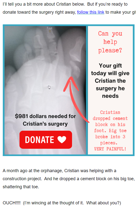
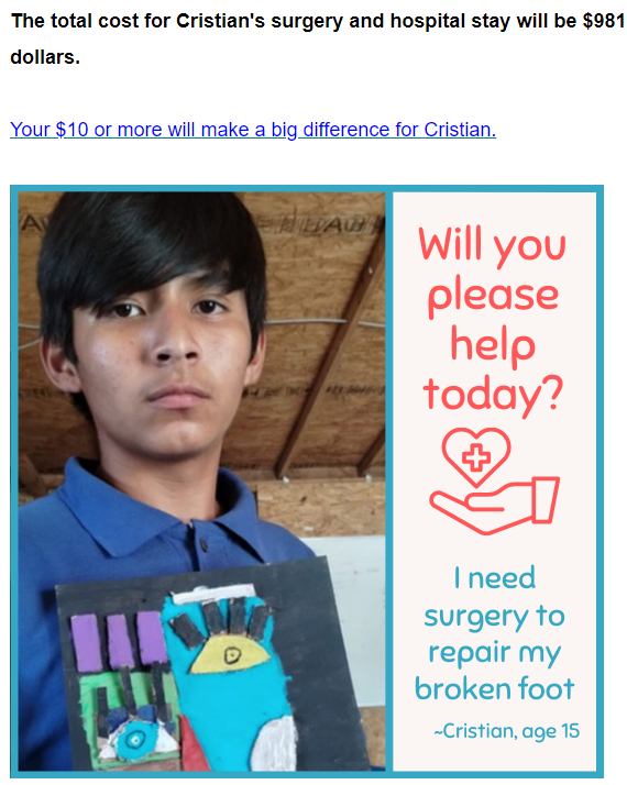
The best caption is not about what’s in the picture, but about what the donor’s gift can contribute to the depicted story. That’s because, words you use to describe what a donor’s gift will do are the most important words in any piece of fundraising. And, since people’s eyes are drawn first to images, including this donor-centric language right off the bat will pull them in to read the rest of your letter. For example:

This excerpt from an appeal by Vida Joven shows what quick copy coupled with a compelling photo can accomplish. And they didn’t stop here. This same e-appeal included another photo with a caption:

You may notice they also got some repetition in there with the restatement of the $981 needed to get the job done. Don’t overlook photos with captions. They’re a simple, powerful fundraising tool.
14. Quirky Formatting
It’s important to mix things up if you want people to take notice. Aside from some of the formatting tips we’ve already covered, what I like to do is include judicious amounts of boldface, italics and underlines. I actually consider my appeals to be three appeals in one. (1) If the donor reads only the boldface, they get the gist. (2) Only the italics? Same deal. (3) Only the underlines? By now, you know the drill.
15. Postscripts
This may be your most valuable piece of real estate. It’s the Monopoly game’s “Park Place” of your appeal. Eye motion studies reveal often folks’ eyes go first to the upper right (maybe a photo or quote), then to the salutation, and then to the signature and P.S. Never ever fail to include a postscript. I like to put the SMIT (single most important thing) there. Generally, this means restating your problem, solution and how the donor can help. “P.S. Remember, your gift of $15, $30, $60 or $90 a month will give a dog who’s experienced trauma a good home.”
16. Page Turns
These offer another opportunity to remind readers of your SMIT. Replace a boring, unnoticed page number with “please continue reading.” Better yet, try something specific like “read more about Celia’s story on the reverse.” Or, perhaps, “See what you can do to help Celia on reverse.”
17. Weird Outer Envelopes (and Plain Ones Too)
In order to avoid the trash bin, you must make your envelope stand out in a crowd. My go-to tactics are: (1) make it a mystery as to who it’s from; (2) make it look fun; (3) trigger the recipient’s fear of missing out, or (4) make it appear urgent. Read more about how to accomplish these things here.
18. Urgency When It’s Urgent
Never cry wolf, but when you absolutely need the money now – tell your readers! Be specific. If they don’t know it’s urgent, they may decide to give to someone else who appears to need it more. The best way to demonstrate urgency is to talk about what will happen if readers don’t give. And I don’t mean something generic like “We won’t reach our goal.” Instead, try something like “our shelter doors will close,” “this essential rainforest will be cleared,” “the after-school program will be canceled,” “seniors will be left with no one to escort them to doctor’s appointments,” and so forth. And, if you have a deadline (e.g., for a matching grant), be clear about this.
19. Clarity Overall
The name of my business is “Clairification,” so I’m clearly biased towards clarity. You might say I was born into it! And it’s common sense. If your message isn’t crystal clear, people won’t act on it. Don’t count on would-be donors to do extra work to understand why your case for support deserves their attention. Towards the end of simplicity and intelligibility, avoid all types of jargon, insider-speak and acronyms.
20. The Oxford Comma
This is the comma some stylebooks suggest you use before the “and” or “or” in a group of at least three items. The reason? It provides the same type of natural pause you would give the sentence were you speaking aloud, adding to clarity of reading. Plus, it eliminates confusion. “We provide children’s services, senior services, homeless services and emergency cash.” Does that mean emergency cash is offered only to the homeless, or is it a service also available to children and seniors? See how the oxford comma clarifies this: “We provide children’s services, senior services, homeless services, and emergency cash.” Emergency cash is clearly a separate program.
21. Lift Notes!!!
This is a little note, separate from the main letter, designed to increase the reader’s connection to and interest in the offer. My favorite type are sticky notes with personal handwriting. Especially from someone the donor knows. Maybe it comes from a donor or volunteer, the development director, or even the same person who signed the letter – just with a more personal message that shows the donor they are “known.” Lift notes can also be on half or quarter-size stationery, written by a beneficiary, an outside authority or influencer or whoever else the reader may admire or listen to. You can even write a note right onto the letter itself. Per fundraising expert Jeff Brooks, a lift note can improve response between 5% and 25%. In my own experience, when I’ve use this tactic with current donors it increased response rate by as much as 34%!
22. Avoiding Reverse or Hard-to-Read Type
This is the white, or light-colored, type peeking through dark paper or a dark screen. Graphic designers love it because it’s dramatic. But it can be very difficult to read. And it’s even worse if the type reverses out of a busy image or pattern. For this reason, advertising guru, David Ogilvy, said that advertising copy should never be set in reverse type. It’s an excellent guideline. Similarly, you should avoid using fonts that are a tough slog for readers. This means generally opting for serif in print materials and sans serif for screens.
Thank you Lisa (and Lisa’s community of readers) for this wonderful list of things it took me decades to learn on my own. I encourage all of you to subscribe to Lisa’s Loyalty Letter so you get the benefit of her wisdom moving forward.
Want More Help With Fundraising Appeal Tactics?

This 62-page e-Guide is a surprisingly quick read — and a true road map to creating a winning fundraising appeal.
Get my Anatomy of a Fundraising Appeal + Sample Template — a thorough e-Guide with everything you need to put together an offer your prospect can’t possibly refuse!
This is super practical stuff I’ve learned over the past 40+ years. Plus I’ll explain to you why I’m suggesting you take the recommended actions — so if anyone tries to dissuade you from doing what you know works, you’ll have the ammunition you need to stick to your guns. That’s how you’ll raise more money.
I guarantee you’ll raise way more than the modest cost of this Guide. If you’re not satisfied, you have my no-questions-asked, 30-day, 100% refund guarantee.
Photo by Oleksandr P: on Pexels.


